
Any variable created using mcerp can be visualized using the plot class method, which has the following syntax:
>>> x1.plot([hist=False], **kwargs)
At the main import (i.e., from mcerp import *), we make available the matplotlib.pyplot sub-module available through the object plt, which is required for later use since the plot function doesn’t automatically display the graph. Thus, we might have the following:
>>> x1.plot()  # No inputs shows the distribution's actual PDF/PMF
>>> plt.show()  # explicit 'show()' required to display to screen
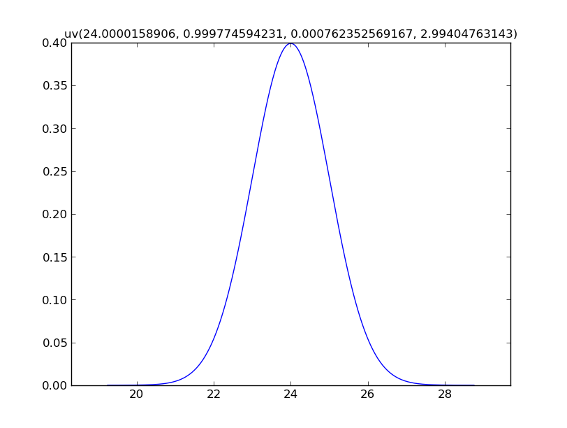
As we can see, the default title is the information about the distribution object and the plot axes is scaled to fit well within the plot window.
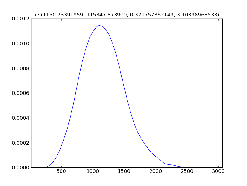
When plotting an object that is a result of prior calculations, since a mathematical PDF/PMF may not be realizable, we resort to approximating the distribution using a Kernel Density Estimate (KDE) of the data:
>>> Z.plot()
>>> plt.show()
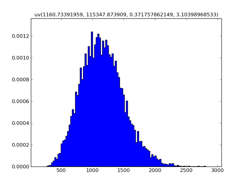
By using the hist=True keyword in the plot function, we an see a histogram of the data instead of the KDE:
>>> Z.plot(hist=True)  # shows a histogram instead of a KDE
>>> plt.show()
Or since showing the plot is explicit, we can do both:
>>> Z.plot()
>>> Z.plot(hist=True)
>>> plt.show()
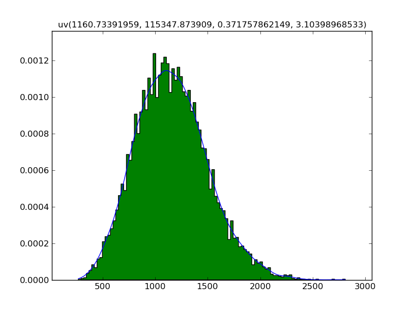
Using Matplotlib’s API, the plot can be customized to the full extent since everything is done before the plot is displayed.