Differential Expression

Plots differential gene expression for selected experiments.
Description
This widget plots a differential gene expression graph for a sample target. It takes gene expression data as an input (from dictyExpress, PIPAx, etc.) and outputs a selected data subset (normally the most interesting genes).
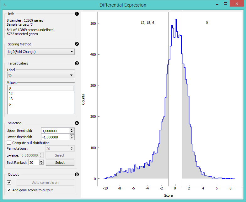
- Information of the data input and output. The first line shows the number of samples and genes in the data set. The second line displays the selected sample target (read around which the graph is plotted). The third line shows the number of undefined gene (missing data) and the fourth the number of genes in the output.
- Select the plotting method in Scoring method:
- Fold change: final to initial value ratio
- log2 (fold change): binary logarithmic transformation of fold change values
- T-test: parametric test of null hypothesis
- T-test (P-value): parametric test of null hypothesis with P-value as criterium
- ANOVA: variance distribution
- ANOVA (P-value): variance distribution with P-value as criterium
- Signal to Noise Ratio: biological signal to noise ratio
- Mann-Whitney: non-parametric test of null hypothesis with P-value as criterium
- Select Target Labels. Labels depend on the attributes in the input. In Values you can change the sample target (default value is the first value on the list, alphabetically or numerically).
- Selection box controls the output data.
- By setting the Lower threshold and Upper threshold values you are outputting the data outside this interval (the most interesting expression levels). You can also manually place the threshold lines by dragging left or right in the plot.
- If you click Compute null distribution box, the widget
will calculate null distribution and display it in the plot. Permutations field allows you to set the precision of
null distribution (the more permutations the more precise the distribution), while
α
-value will be the allowed probability of false positives. Press Select to output this data.
- The final option is to set the number of best ranked genes and output them with Select.
- When Auto commit is on is ticked, the widget will automatically apply the changes. Alternatively press Commit. If the Add gene scores to output is ticked, the widget will append an additional column with gene scores to the data.
Example
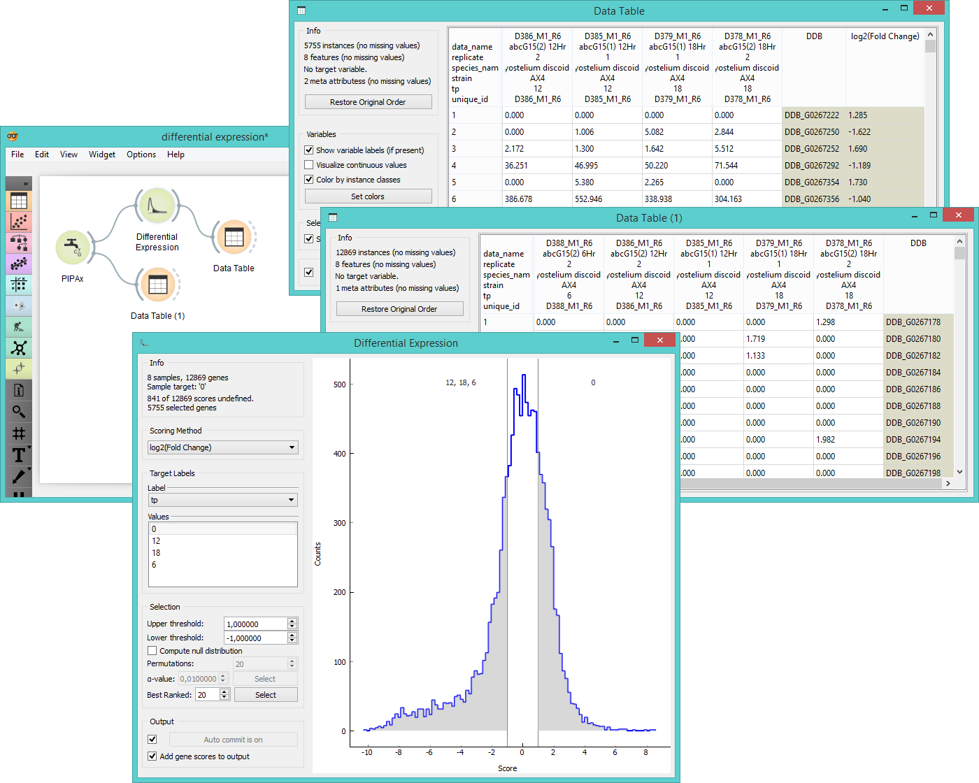
In the example below we chose two experiments from the PIPAx widget ( 8 experiments measuring gene expression levels on Dictyostelium discoideum at different timepoints) and observed them in the Data Table. Then we used the Differential Expression widget to select the most interesting genes. We left upper and lower threshold at default (1 and -1) and output the data. Then we observed the selected data in another Data Table. As we have ticked the Add gene scores to output, the table shows an additional column with gene scores as instances.