prob140 Tutorial!
This is a brief introduction to the functionality in prob140! For an
interactive guide, see the examples notebook in the GitLab directory.
Table of Contents
Getting Started
Make sure you are on the most recent version of the prob140 library. See the installation guide for more directions.
If you are using an iPython notebook, use this as your first cell:
# HIDDEN

from datascience import *
from prob140 import *
%matplotlib inline
import matplotlib.pyplot as plt
import numpy as np
plt.style.use('fivethirtyeight')
You may want to familiarize yourself with Data8’s datascience documentation first
Creating a Distribution
The prob140 library adds distribution methods to the default table class that you should already be familiar with. A distribution is defined as a 2-column table in which the first column represents the domain of the distribution while the second column represents the probabilities associated with each value in the domain.
You can specify a list or array to the methods domain and probability to specify those columns for a distribution
In [1]: from prob140 import *

In [2]: dist1 = Table().domain(make_array(2, 3, 4)).probability(make_array(0.25, 0.5, 0.25))

In [3]: dist1
Out[3]:
Value | Probability
2     | 0.25
3     | 0.5
4     | 0.25
We can also construct a distribution by explicitly assigning values for the domain but applying a probability function to the values of the domain
In [4]: def p(x):
...: return 0.25
...:
In [5]: dist2 = Table().domain(np.arange(1, 8, 2)).probability_function(p)
In [6]: dist2
��������������������������������������������������������������������������������������������������������������������������������������������������������������������������������������������������������������������������������������������������������������������������������������������������������������������������������������������������������������������������������������������������������������������������������������������������������������������������������������������������������������������������������������������������������������������������������������������������������������������������������������������������������Out[6]:
Value | Probability
1 | 0.25
3 | 0.25
5 | 0.25
7 | 0.25
This can be very useful when we have a distribution with a known probability density function
In [7]: from scipy.misc import comb
In [8]: def pmf(x):
...: n = 10
...: p = 0.3
...: return comb(n,x) * p**x * (1-p)**(n-x)
...:
In [9]: binomial = Table().domain(np.arange(11)).probability_function(pmf)
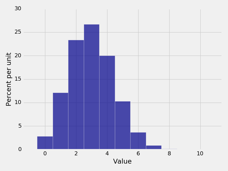
In [10]: binomial
��������������������������������������������������������������������������������������������������������������������������������������������������������������������������������������������������������������������������������������������������������������������������������������������������������������������������������������������������������������������������������������������������������������������������������������������������������������������������������������������������������������������������������������������������������������������������������������������������������������������������������������������������������Out[10]:
Value | Probability
0 | 0.0282475
1 | 0.121061
2 | 0.233474
3 | 0.266828
4 | 0.200121
5 | 0.102919
6 | 0.0367569
7 | 0.00900169
8 | 0.0014467
9 | 0.000137781
... (1 rows omitted)
Events
Often, we are concerned with specific values in a distribution rather than all the values.
Calling event allows us to see a subset of the values in a distribution and the associated probabilities
In [11]: dist1
Out[11]:
Value | Probability
2 | 0.25
3 | 0.5
4 | 0.25
In [12]: dist1.event(np.arange(1,4))
��������������������������������������������������������������������Out[12]:
Outcome | Probability
1 | 0
2 | 0.25
3 | 0.5
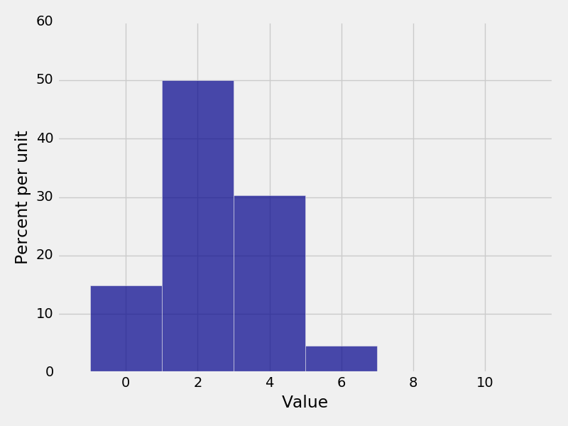
In [13]: dist2
���������������������������������������������������������������������������������������������������������������������������������������������Out[13]:
Value | Probability
1 | 0.25
3 | 0.25
5 | 0.25
7 | 0.25
In [14]: dist2.event([1, 3, 3.5, 6])
�������������������������������������������������������������������������������������������������������������������������������������������������������������������������������������������������������������������������������Out[14]:
Outcome | Probability
1 | 0.25
3 | 0.25
3.5 | 0
6 | 0
To find the probability of an event, we can call prob_event, which sums up the probabilities
of each of the values
In [15]: dist1.prob_event(np.arange(1,4))
Out[15]: 0.75
In [16]: dist2.prob_event([1, 3, 3.5, 6])
��������������Out[16]: 0.5
In [17]: binomial.prob_event(np.arange(5))
���������������������������Out[17]: 0.8497316673999995
In [18]: binomial.prob_event(np.arange(11))
�������������������������������������������������������Out[18]: 0.99999999999999922
Note that due to the way Python handles floats, there might be some rounding errors
Plotting
To visualize our distributions, we can plot a histogram of the density using the Plot function.
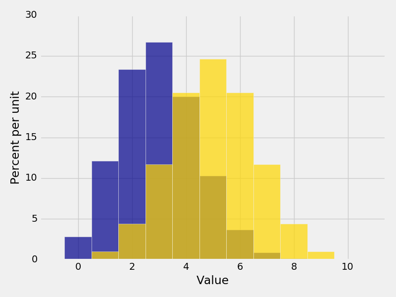
In [19]: Plot(binomial)
In [20]: Plot(dist2)
Width
If want to specify the width of every bar, we can use the optional parameter width= to specify the bin sizes.
However, this should be used very rarely, only when there is uniform spacing between bars.
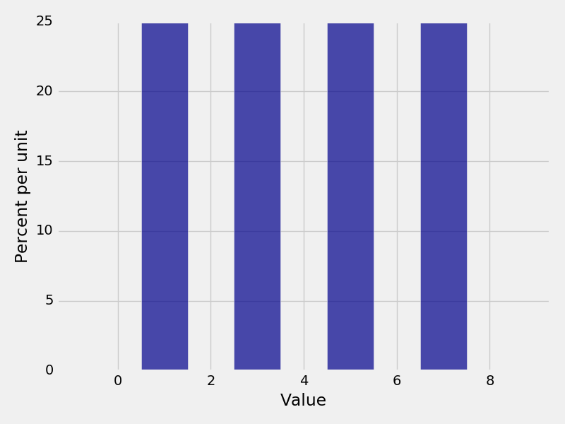
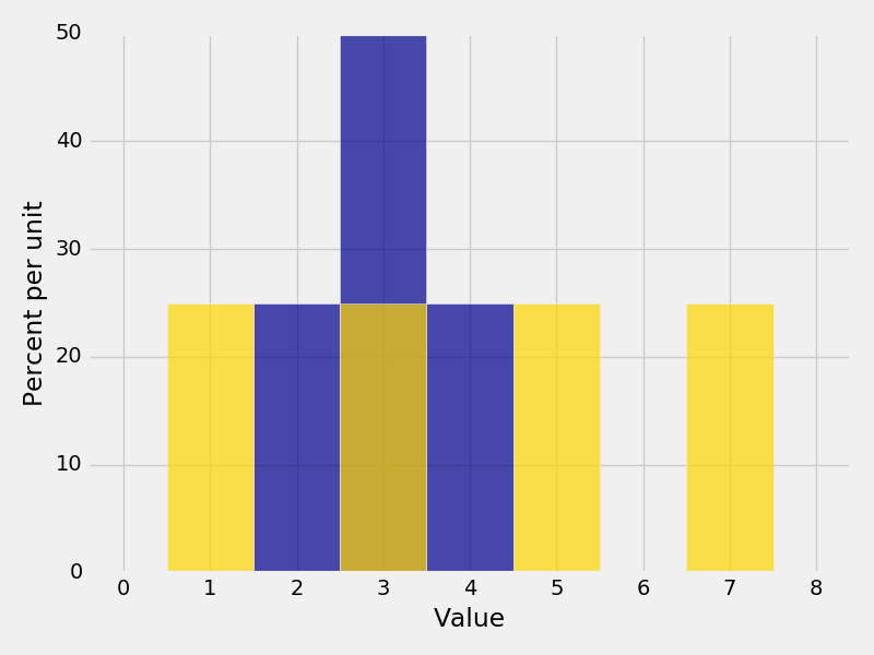
In [21]: Plot(binomial, width=2)
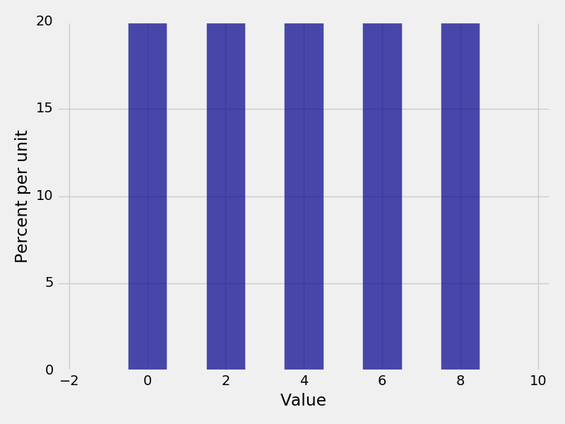
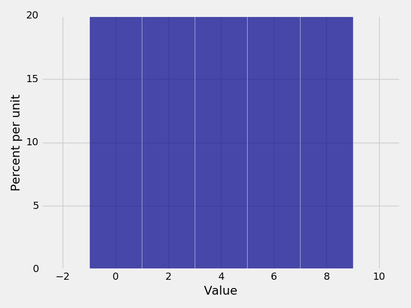
In [22]: dist3 = Table().domain(np.arange(0, 10, 2)).probability_function(lambda x: 0.2)

In [23]: Plot(dist3)
In [24]: Plot(dist3, width=2)
Events
Sometimes, we want to highlight an event or events in our histogram. Do make an event a different color, we can use
the optional parameter event=. An event must be a list or a list of lists.
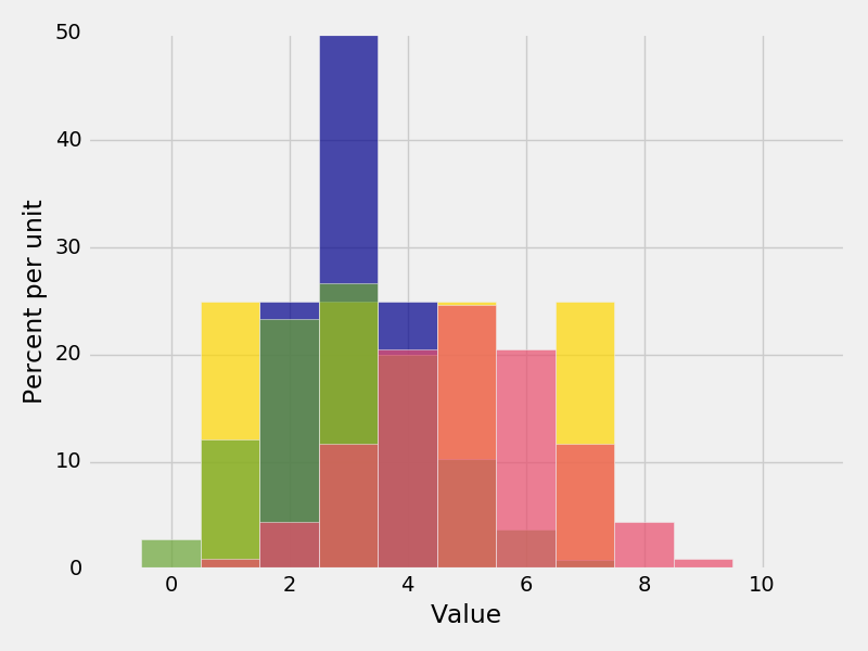
In [25]: Plot(binomial, event=[1,3,5])
In [26]: Plot(binomial, event=np.arange(0,10,2))
If we use a list of lists for the event parameter, each event will be a different color.
In [27]: Plot(binomial, event=[[0],[1],[2],[3],[4],[5],[6],[7],[8],[9],[10]])
Plotting multiple distributions
It is often useful to plot multiple histograms on top of each other. To plot multiple distributions on the same
graph, use the Plots function. Plots takes in an even number of arguments, alternating between the label of
the distribution and the distribution table itself.
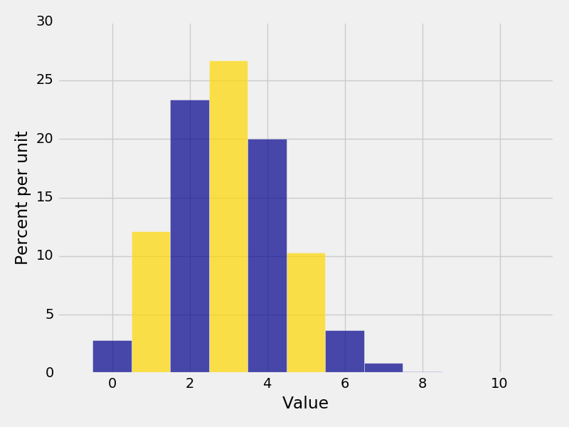
In [28]: Plots("Distribution 1", dist1, "Distribution 2", dist2)
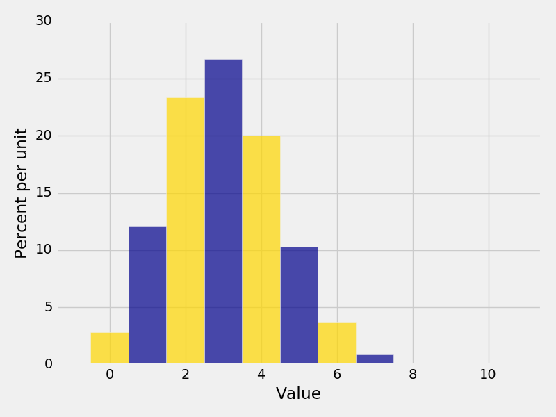
In [29]: binomial2 = Table().domain(np.arange(11)).probability_function(lambda x: comb(10,x) * 0.5**10)

In [30]: Plots("Bin(n=10,p=0.3)", binomial, "Bin(n=10,p=0.5)", binomial2)
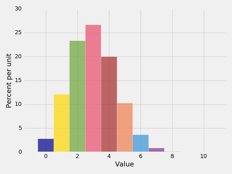
Try to avoid plotting too many distributions together because the graph starts to become unreadable
In [31]: Plots("dist1", dist1, "dist2", dist2, "Bin1", binomial, "Bin2", binomial2)
Empirical Distributions
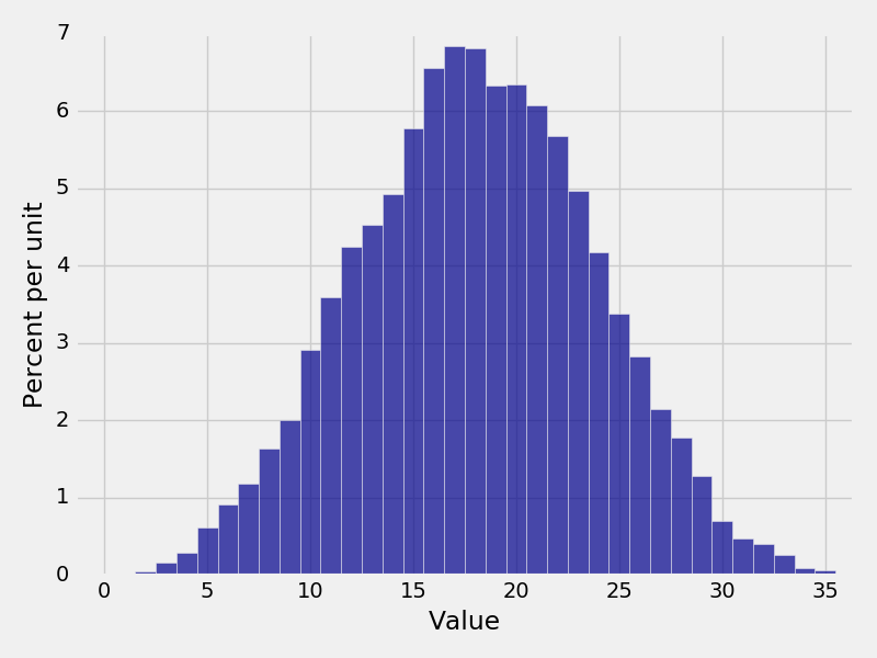
Whenever we simulate an event, we often end up with an array of results. We can construct an empirical distribution of the results by grouping of the possible values and assigning the frequencies are probabilities. An easy way to do this is by calling emp_dist
In [32]: x = make_array(1,1,1,1,1,2,3,3,3,4)

In [33]: emp_dist(x)
Out[33]:
Value | Proportion
1     | 0.5
2     | 0.1
3     | 0.3
4     | 0.1

In [34]: values = make_array()

In [35]: for i in range(10000):
   ....:     num = np.random.randint(10) + np.random.randint(10) + np.random.randint(10) + np.random.randint(10)
   ....:     values = np.append(values, num)
   ....:
In [36]: Plot(emp_dist(values))
Utilities
In [37]: print(dist1.expected_value())
3.0
In [38]: print(dist1.sd())
����0.7071067811865476
In [39]: print(binomial.expected_value())
�����������������������3.0
In [40]: print(0.3 * 10)
���������������������������3.0
In [41]: print(binomial.sd())
�������������������������������1.4491376746189442
In [42]: import math
In [43]: print(math.sqrt(10 * 0.3 * 0.7))
1.4491376746189437
In [44]: print(binomial.variance())
�������������������2.1
In [45]: print(10 * 0.3 * 0.7)
�����������������������2.0999999999999996