Branding customization guidelines
Mision
The look&feel of the PEER website, will be adaptable to differents worldwide services that will come up.
To assure a global identification underneath to all of the future design themes, PEER style guidelines are being evolved as a reference point for all designers creating a PEER website.
There are two main categories in this section: locked things and customizable things.
Locked things
Page layout & content placement
The page width is 1024px but the content is limited to 960px width. Indeed there’s main page division, leaving a 242px right side column in content block. This right column will appear on multiple site´s views and will always show content related actions.
An 17px baseline grid is used to help with vertical alignment page components.
Firm adherence to the baseline isn’t necessary for all typography but it does help to create vertical rhythm on the page.
Blocks height and width values, on the page layout will be locked for the future PEER themes.
Customizable things
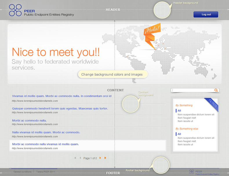
Background colors and images
Header, content and footer background are free to apply any style change on their background color and image properties.
Actually they could be different from each other, given as a result, a new creative site look&feel.
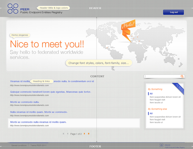
Font styles
Headings, links, and body text styles are wholly free to change in any of their style properties.
In this guides group must to be mentioned, the home banner, that obviously, is free to change completly its image and slogan.