Example 2: Differential expression scatterplots
This example looks more closely at using the results table part of metaseq, and highlights the flexibility in plotting afforded by metaseq.
# Enable in-line plots for this IPython Notebook
%matplotlib inline
Setup
In this section, we’ll get the example data for control and knockdown samples, combine the data, and and create ResultsTable object out of them.
If you haven’t already done so, run the download_metaseq_example_data.py script, which will download and prepare from public sources.
Import what we’ll be using:
import metaseq
from metaseq import example_filename
from metaseq.results_table import ResultsTable
import pandas
import numpy as np
import matplotlib
import pybedtools
import gffutils
from gffutils.helpers import asinterval
import os
We’ll be using tables prepared from Cufflinks GTF output from GEO entries GSM847565 and GSM847566. These represent results control and ATF3 knockdown experiments in the K562 human cell line. You can read more about the data on GEO; this example will be more about the features of metaseq than the biology.
Let’s get the example files:
%%bash
example_dir="metaseq-example"
if [ -e $example_dir ]; then echo "already exists";
else
    mkdir -p $example_dir
    (cd $example_dir \
    && wget --progress=dot:giga https://raw.githubusercontent.com/daler/metaseq-example-data/master/metaseq-example-data.tar.gz \
    && tar -xzf metaseq-example-data.tar.gz \
    && rm metaseq-example-data.tar.gz)
fi
already exists
data_dir = 'metaseq-example/data'
control_filename = os.path.join(data_dir, 'GSM847565_SL2585.table')
knockdown_filename = os.path.join(data_dir, 'GSM847566_SL2592.table')
Let’s take a quick peak to see what these files look like:
# System call; IPython only!
!head -n5 $control_filename
id  score   fpkm
ENST00000456328     108.293110992801        1.1183355144
ENST00000515242     87.2330185289764        0.8306172562
ENST00000518655     175.175608597549        2.3676823979
ENST00000473358     343.232678519699        9.7952652359
As documented at http://cufflinks.cbcb.umd.edu/manual.html#gtfout, the score field indicates relative expression of one isoform compared to other isoforms of the same gene, times 1000. The max score is 1000, and an isoform with this score is considered the major isoform. A score of 800 would mean an isoform’s FPKM is 0.8 that of the major isoform.
If you’re working with DESeq results, the metaseq.results_table.DESeqResults class is a nice wrapper around those results with one-step import. But here, we’ll construct a pandas.DataFrame first and then create a ResultsTable object out of it.
# Create two pandas.DataFrames

control = pandas.read_table(control_filename, index_col=0)
knockdown = pandas.read_table(knockdown_filename, index_col=0)
Here’s what the first few entries look like:
control.head()
| score | fpkm | |
|---|---|---|
| id | ||
| ENST00000456328 | 108.293111 | 1.118336 |
| ENST00000515242 | 87.233019 | 0.830617 |
| ENST00000518655 | 175.175609 | 2.367682 |
| ENST00000473358 | 343.232679 | 9.795265 |
| ENST00000408384 | 0.000000 | 0.000000 |
knockdown.head()
| score | fpkm | |
|---|---|---|
| id | ||
| ENST00000456328 | 290.752543 | 6.503301 |
| ENST00000515242 | 253.364453 | 4.790326 |
| ENST00000518655 | 23.190962 | 0.174388 |
| ENST00000473358 | 510.475081 | 33.409877 |
| ENST00000408384 | 0.000000 | 0.000000 |
These are two separate objects. It will be easier to work with the data if we first combine the data into a single dataframe. For this we will use standard pandas routines:
# Merge control and knockdown into one DataFrame

df = pandas.merge(control, knockdown, left_index=True, right_index=True, suffixes=('_ct', '_kd'))
df.head()
| score_ct | fpkm_ct | score_kd | fpkm_kd | |
|---|---|---|---|---|
| id | ||||
| ENST00000456328 | 108.293111 | 1.118336 | 290.752543 | 6.503301 |
| ENST00000515242 | 87.233019 | 0.830617 | 253.364453 | 4.790326 |
| ENST00000518655 | 175.175609 | 2.367682 | 23.190962 | 0.174388 |
| ENST00000473358 | 343.232679 | 9.795265 | 510.475081 | 33.409877 |
| ENST00000408384 | 0.000000 | 0.000000 | 0.000000 | 0.000000 |
Now we’ll create a metaseq.results_table.ResultsTable out of it:
# Create a ResultsTable

d = ResultsTable(df)
ResultsTable objects are wrappers around pandas.DataFrame objects, and are useful for working with annotations and tablular data. You can always access the DataFrame with the .data attribute:
# DataFrame is always accessible via .data

print type(d), type(d.data)
<class 'metaseq.results_table.ResultsTable'> <class 'pandas.core.frame.DataFrame'>
The metaseq example data includes a GFF file of the genes on chromosome 17 of the hg19 human genome assembly:
# Get gene annotations for chr17

gtf = os.path.join(data_dir, 'Homo_sapiens.GRCh37.66_chr17.gtf')
print open(gtf).readline()
chr17 protein_coding exon 30898 31270 . - . gene_id "ENSG00000187939"; transcript_id "ENST00000343572"; exon_number "1"; gene_name "DOC2B"; gene_biotype "protein_coding"; transcript_name "DOC2B-201";
Subsetting data
The data we loaded from the knockdown experiment contains genes from all chromosomes. For the sake of argument, let’s say we’re only interested in the expression data for these genes on chr17. We can simply use pandas.DataFrame.ix to subset dataframe by a list of genes. Note that for this to work, the items in the list need to be in the index of the dataframe. Since the data frame index consists of Ensembl transcript IDs, we’ll need to create a list of Ensembl transcript IDs on chromosome 17:
# Get a list of transcript IDs on chr17, and subset the dataframe.

# Here we use pybedtools, but the list of names can come from anywhere
names = list(set([i['transcript_id'] for i in pybedtools.BedTool(gtf)]))
names.sort()

# Make a copy of d
d2 = d.copy()

# And subset
d2.data = d2.data.ix[names]

# How many did we omit?
print "original:", len(d.data)
print "chr17 subset:", len(d2.data)
original: 85699
chr17 subset: 5708
Scatterplots
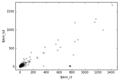
Let’s plot some data. The ResultsTable.scatter() method helps with plotting genome-wide data, and offers lots of flexibility.
For its most basic usage, we need to at least supply x and y. These are names of variables in the dataframe. We’ll add more data later, but for now, let’s plot the FPKM of control vs knockdown:
# Scatterplot of control vs knockdown FPKM
d2.scatter(
    x='fpkm_ct',
    y='fpkm_kd');
If you’re following along in a terminal with interactive matplotlib plots, you can click on a point to see what gene it is. In this IPython Notebook (and the HTML documentation generated from it), we don’t have that interactive ability. We can simulate it here by choosing a gene ID to show, and then manually call the _default_callback like this:
# arbitrary gene for demonstration purposes
interesting_gene = np.argmax(d2.fpkm_ct)
interesting_gene
'ENST00000253788'
# What happens if you were to click on the points in an interactive session
d2._default_callback(interesting_gene)
score_ct    1047.517457
fpkm_ct     1422.448488
score_kd    1070.752317
fpkm_kd     1671.190119
Name: ENST00000253788, dtype: float64
Clicking around interactively on the points is a great way to get a feel for the data.
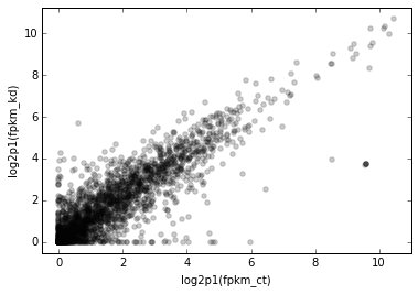
OK, it looks like this plot could use log scaling. Recall though that the ResultsTable.scatter method needs to have x and y variables available in the dataframe. So one way to do this would be to do something like this:
# Adding extra variables gets verbose and cluttered
d2.data['log_fpkm_ct'] = np.log1p(d2.data.fpkm_ct)
But when playing around with different scales, this quickly pollutes the dataframe with extra columns. Let’s delete that column . . .
# We'll use a better way, so delete it.
del d2.data['log_fpkm_ct']
. . . and show another way.
You may find it more streamlined to use the xfunc and/or yfunc arguments. We can use any arbitrary function for these, and the axes labels will reflect that.
Since we’re about to start incrementally improving the figure by adding additional keyword arguments (kwargs), the stuff we’ve already talked about will be at the top, and a comment line like this will mark the start of new stuff to pay attention to:
# ------------- (marks the start of new stuff)
Here’s the next version of the scatterplot:
# Scale x and y axes using log2(x + 1)

def log2p1(x):
    return np.log2(x + 1)

d2.scatter(
    x='fpkm_ct',
    y='fpkm_kd',
    #----------------
    xfunc=log2p1,
    yfunc=log2p1,
    );
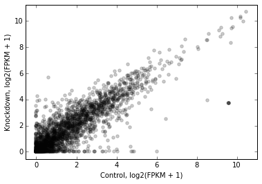
Of course, we can specify axes labels either directly in the method call with xlab or ylab, or after the fact using standard matplotlib functionality:
# Manually specify x and y labels

ax = d2.scatter(
    x='fpkm_ct',
    y='fpkm_kd',
    xfunc=log2p1,
    yfunc=log2p1,

    #-----------------------------
    # specify xlabel
    xlab='Control, log2(FPKM + 1)'
    );

# adjust the ylabel afterwards
ax.set_ylabel('Knockdown, log2(FPKM + 1)');
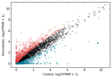
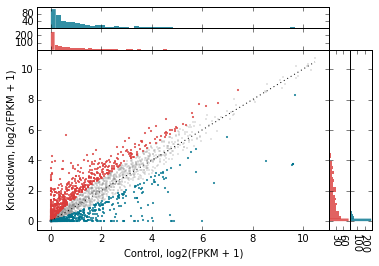
Let’s highlight some genes. How about those that change expression > 2 fold in upon knockdown in red, and < 2 fold in blue? While we’re at it, let’s add another variable to the dataframe.
# Crude differential expression detection....

d2.data['foldchange'] = d2.fpkm_kd / d2.fpkm_ct
up = (d2.foldchange > 2).values
dn = (d2.foldchange < 0.5).values
The way to highlight genes is with the genes_to_highlight argument. OK, OK, it’s a little bit of a misnomer here because we’re actually working with transcripts. But the idea is the same.
The genes_to_highlight argument takes a list of tuples. Each tuple consists of two items: an index (boolean or integer, doesn’t matter) and a style dictionary. This dictionary is passed directly to matplotlib.scatter, so you can use any supported arguments here.
Note
There are actually other kwargs you can use in the style dictionary – for example, names, marginal_histograms, xhist_kwargs, and yhist_kwargs. These are metaseq-specific and will be explained later.
Here’s the plot with up/downregulated genes highlighted:
# Use the genes_to_highlight argument to show up/downregulated genes
# in different colors

d2.scatter(
    x='fpkm_ct',
    y='fpkm_kd',
    xfunc=log2p1,
    yfunc=log2p1,
    xlab='Control, log2(FPKM + 1)',
    ylab='Knockdown, log2(FPKM + 1)',
    #-------------------------------
    genes_to_highlight=[
        (up, dict(color='#da3b3a')),
        (dn, dict(color='#00748e'))]
    );
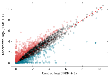
We can add a 1-to-1 line for reference:
# Add a 1:1 line

d2.scatter(
    x='fpkm_ct',
    y='fpkm_kd',
    xfunc=log2p1,
    yfunc=log2p1,
    xlab='Control, log2(FPKM + 1)',
    ylab='Knockdown, log2(FPKM + 1)',
    genes_to_highlight=[
        (up, dict(color='#da3b3a')),
        (dn, dict(color='#00748e'))],
    #------------------------------------------
    one_to_one=dict(color='r', linestyle='--'),
    );
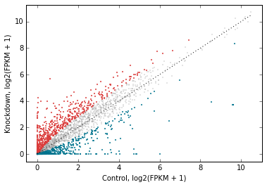
Let’s change the plot style a bit. The general_kwargs argument determines the base style of all points. By default, it’s dict(color=’k’, alpha=0.2, linewidths=0). Let’s change the default style to smaller gray dots, and make the red and blue stand out more by adjusting their alpha:
# Style changes:
# default gray small dots; make changed genes stand out more

d2.scatter(
    x='fpkm_ct',
    y='fpkm_kd',
    xfunc=log2p1,
    yfunc=log2p1,
    xlab='Control, log2(FPKM + 1)',
    ylab='Knockdown, log2(FPKM + 1)',
    one_to_one=dict(color='k', linestyle=':'),
    #------------------------------------------------------
    genes_to_highlight=[
        (up, dict(color='#da3b3a', alpha=0.8)),
        (dn, dict(color='#00748e', alpha=0.8))],
    general_kwargs=dict(marker='.', color='0.5', alpha=0.2, s=5),
    );
Marginal histograms
metaseq also offers support for marginal histograms, which are stacked up on either axes for each set of genes that were plotted. There are lots of ways for configuring this. First, let’s turn them on for everything:
# Add marginal histograms

d2.scatter(
    x='fpkm_ct',
    y='fpkm_kd',
    xfunc=log2p1,
    yfunc=log2p1,
    xlab='Control, log2(FPKM + 1)',
    ylab='Knockdown, log2(FPKM + 1)',
    genes_to_highlight=[
        (up, dict(color='#da3b3a', alpha=0.8)),
        (dn, dict(color='#00748e', alpha=0.8))],
    one_to_one=dict(color='k', linestyle=':'),
    general_kwargs=dict(marker='.', color='0.5', alpha=0.2, s=5),
    #------------------------------------------------------
    marginal_histograms=True,
    );
As a contrived example to illustrate the flexibility for plotting marginal histograms, lets:
- only show histograms for up/down regulated
- change the number of bins to 50
- remove the edge around each bar
# Tweak the marginal histograms:
# 50 bins, don't show unchanged genes, and remove outlines

d2.scatter(
    x='fpkm_ct',
    y='fpkm_kd',
    xfunc=log2p1,
    yfunc=log2p1,
    xlab='Control, log2(FPKM + 1)',
    ylab='Knockdown, log2(FPKM + 1)',
    one_to_one=dict(color='k', linestyle=':'),
    general_kwargs=dict(marker='.', color='0.5', alpha=0.2, s=5),
    #------------------------------------------------------
    # Go back go disabling them globally...
    marginal_histograms=False,

    # ...and then turn them back on for each set of genes
    # to highlight.
    #
    # By the way, genes_to_highlight is indented to better show the
    # the structure.
    genes_to_highlight=[
    (
     up,
     dict(
          color='#da3b3a', alpha=0.8,
          marginal_histograms=True,
          xhist_kwargs=dict(bins=50, linewidth=0),
          yhist_kwargs=dict(bins=50, linewidth=0),
          )
     ),
    (
     dn,
     dict(
          color='#00748e', alpha=0.8,
          marginal_histograms=True,
          xhist_kwargs=dict(bins=50, linewidth=0),
          yhist_kwargs=dict(bins=50, linewidth=0),
          )
     )
    ],
);
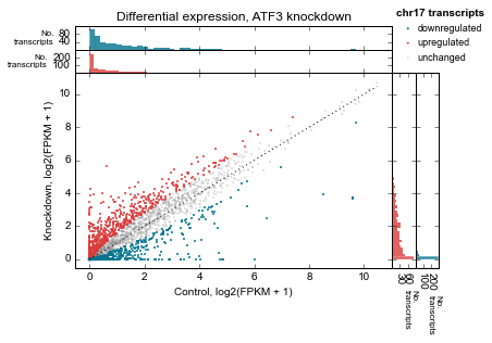
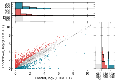
Let’s clean up the plot by adding a legend (using label in genes_to_highlight), and adding it outside the axes. While we’re at it we’ll add a title, too.
There’s a trick here – for each set of genes, the histograms are incrementally added on top of each other but the legend, lists them going down. So we need to flip the order of legend entries to make it nicely match the order of the histograms.
matplotlib.rcParams['font.family'] = "Arial"
ax = d2.scatter(
    x='fpkm_ct',
    y='fpkm_kd',
    xfunc=log2p1,
    yfunc=log2p1,
    xlab='Control, log2(FPKM + 1)',
    ylab='Knockdown, log2(FPKM + 1)',
    one_to_one=dict(color='k', linestyle=':'),
    marginal_histograms=False,
    #------------------------------------------------------
    # add the "unchanged" label
    general_kwargs=dict(marker='.', color='0.5', alpha=0.2, s=5, label='unchanged'),

    genes_to_highlight=[
    (
     up,
     dict(
          color='#da3b3a', alpha=0.8,
          marginal_histograms=True,
          xhist_kwargs=dict(bins=50, linewidth=0),
          yhist_kwargs=dict(bins=50, linewidth=0),

          # add label
          label='upregulated',
          )
     ),
    (
     dn,
     dict(
          color='#00748e', alpha=0.8,
          marginal_histograms=True,
          xhist_kwargs=dict(bins=50, linewidth=0),
          yhist_kwargs=dict(bins=50, linewidth=0),

          # add label
          label='downregulated'
          )
     )
    ],
);

# Get handles and labels, and then reverse their order
handles, legend_labels = ax.get_legend_handles_labels()
handles = handles[::-1]
legend_labels = legend_labels[::-1]

# Draw a legend using the flipped handles and labels.
leg = ax.legend(handles,
          legend_labels,

          # These values may take some tweaking.
          # By default they are in axes coordinates, so this means
          # the legend is slightly outside the axes.
          loc=(1.01, 1.05),

          # Various style fixes to default legend.
          fontsize=9,
          scatterpoints=1,
          borderpad=0.1,
          handletextpad=0.05,
          frameon=False,
          title='chr17 transcripts',
          );

# Adjust the legend title after it's created
leg.get_title().set_weight('bold')
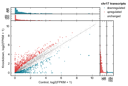
We’d also like to add a title. But how to access the top-most axes?
Whenever the scatter method is called, the MarginalHistograms object created as a by-product of the plotting is stored in the marginal attribute. This, in turn, has a top_hists attribute, and we can grab the last one created. While we’re at it, let’s histograms axes as well.
# Another trick: every time `d2.scatter` is called,
top_axes = d2.marginal.top_hists[-1]
top_axes.set_title('Differential expression, ATF3 knockdown');

for ax in d2.marginal.top_hists:
    ax.set_ylabel('No.\ntranscripts', rotation=0, ha='right', va='center', size=8)

for ax in d2.marginal.right_hists:
    ax.set_xlabel('No.\ntranscripts', rotation=-90, ha='left', va='top', size=8)

fig = ax.figure
fig.savefig('expression-demo.png')
fig