MA Plot

Visualization of intensity-dependent ratios of raw microarray data.
Signals
Inputs:
Expression Array
DNA microarray.
Outputs:
Normalized Expression Array
Lowess-normalized microarray.
Filtered Expression Array
Selected instances (in the Z-score cutoff).
Description
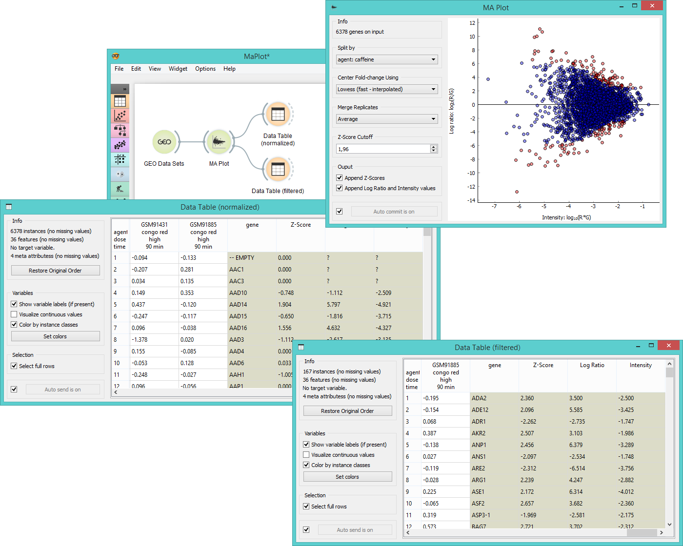
MA Plot is a graphical method for visualizing intensity-dependent ratio of raw mircoarray data. The A represents the average log intensity of the gene expression (x-axis in the plot), while M stands for the binary log of intensity ratio (y-axis). The widget outputs either normalized data (Lowess normalization method) or instances above the Z-score cutoff line (instances with meaningful fold changes).
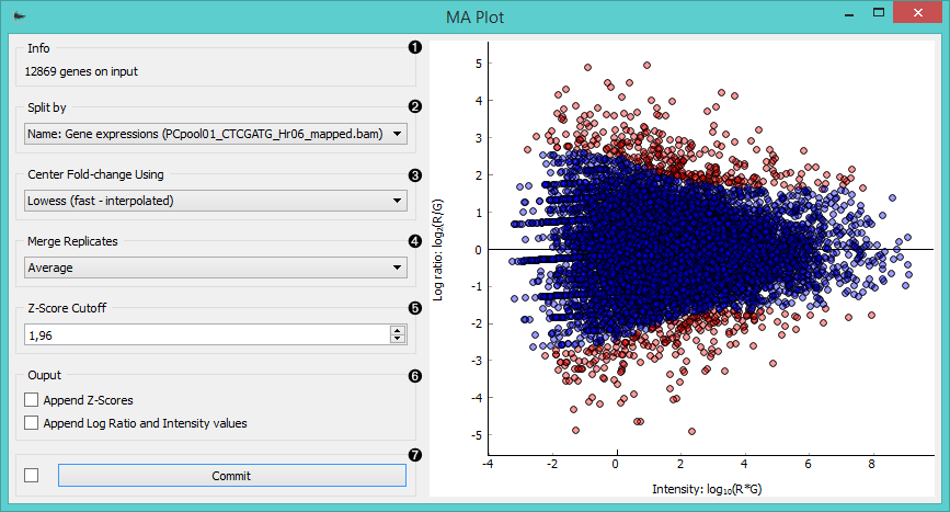
- Information on the input data.
- Select the attribute to split the plot by.
- Center the plot using:
- average
- Lowess (fast-interpolated) normalization method
- Lowess normalization method
- Merge replicated by:
- average
- median
- geometric mean
- Set the Z-score cutoff threshold. Z-score is your confidence interval and it is set to 95% by default. If the widget is set to output filtered expression array, instances above the Z-score threshold will be in the output (red dots in the plot).
- Ticking the Append Z-scores will add an additional meta attribute with Z-scores to your output data.
Ticking the Append Log ratio and Intensity values will add two additional meta attributes with M and A values to your output data. - If Auto commit is on, the widget will automatically apply changes to the output. Alternatively click Commit.
Example
MA Plot is a great widget for data visualization and selection. First we select Caffeine effect: time course and dose response data from the GEO Data Sets widget and feed it to MA Plot. In the plot we see intensity ratios for a selected experiment variable.
We often need to normalize the experiment data to avoid systematic biases, thus we select Lowess (fast-interpolated) in the Center Fold-change box. By ticking both boxes in the Output subsection, we get three new meta attributes appended - Z-score, Log ratio and Intensity. We see these new attributes and normalized instances in the Data Table (normalized).
Another possible output for the MA plot widget is Filtered expression array, which will give us instances above the Z-score cutoff threshold (red dots in the plot). We observe these instances the Data Table (filtered).