Data Profiles

Plots gene expression levels by attribute in a graph.
Signals
Inputs:
Data
Data set.
Outputs:
Selected Data
Instances that the user has manually selected from the plot.
Description
Data Profiles plots gene expression levels for each attribute in a graph. The default graph displays the mean expression level for the input data set. The x-axis represents attributes and the y-axis gene expression values. By hovering over the line you can see which gene it represents and by click on the line you will select the gene and output it.
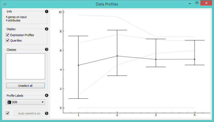
- Information on the input data.
- Select display options:
- Expression Profiles will display expression levels for individual data instances.
- Quartiles will show quartile cut-off points.
- If the data has classes, you can select which class to display by clicking on it. Such data will also be colored by class. Unselect All will show an empty plot, while Select All will diplay all data instances by class.
- Select which attribute you wish to use as a profile label.
- If Auto commit is on, the widget will automatically apply changes to the output. Alternatively click Commit.
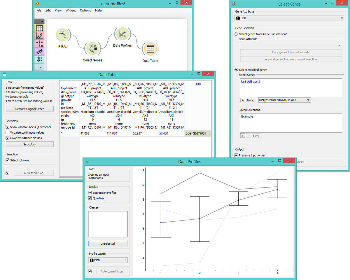
Example
Data Profiles is a great widget for visualizing significant gene expression levels, especially if the data has been sourced at different timepoints. This allows the user to see differences in expression levels in time for each instance in the data set and the overall mean.
Below we used the PIPAx widget, where we selected 8 AX4 Dictyostelium experiments, all having been sourced at diffferent timepoints and belonging to one of the two replicates. We decided to average replicates (to get one instance for both replicates) and to apply logarithmic transformation to adjust expression levels.
In Select Genes we decided to observe only the three genes from the data set that are a part of the increased exocytosis process (lsvB, pldB, amp3), which we selected in the Import gene set names option. This allows us to specify which biological process we’re interested in and to observe only the specified genes.
Then we observe expression levels in Data Profiles widget, where we see all three Expression Profiles plotted, together with Quartiles and mean expression level. Finally, we selected the gene with the highest overall expression level and output it to Data Table.