 wx.ribbon.RibbonButtonBar
A ribbon button bar is similar to a traditional toolbar.
It contains one or more buttons (button bar buttons, not Buttons), each of which has a label and an icon. It differs from a wx.ribbon.RibbonToolBar in several ways:
 Events Emitted by this Class
Handlers bound for the following event types will receive a wx.ribbon.RibbonButtonBarEvent parameter.
wx.ribbon.RibbonButtonBarEvent.PopupMenu should be called by the event handler if it wants to display a popup menu (which is what most dropdown buttons should be doing). Methods Summary
__init__ |
Default constructor. |
AddButton |
Add a button to the button bar (simple version). |
AddDropdownButton |
Add a dropdown button to the button bar (simple version). |
AddHybridButton |
Add a hybrid button to the button bar (simple version). |
AddToggleButton |
Add a toggle button to the button bar (simple version). |
ClearButtons |
Delete all buttons from the button bar. |
Create |
Create a button bar in two-step button bar construction. |
DeleteButton |
Delete a single button from the button bar. |
EnableButton |
Enable or disable a single button on the bar. |
GetActiveItem |
Returns the active item of the button bar or None if there is none. |
GetButtonCount |
Returns the number of buttons in this button bar. |
GetHoveredItem |
Returns the hovered item of the button bar or None if there is none. |
GetItem |
Returns the N-th button of the bar. |
GetItemById |
Returns the first button having a given id or None if none matches. |
GetItemClientData |
Get the client object associated with a button. |
GetItemId |
Returns the id of a button. |
GetShowToolTipsForDisabled |
Sets whether tooltips should be shown for disabled buttons or not. |
InsertButton |
Inserts a button to the button bar (simple version) at the given position. |
InsertDropdownButton |
Inserts a dropdown button to the button bar (simple version) at the given position. |
InsertHybridButton |
Inserts a hybrid button to the button bar (simple version) at the given position. |
InsertToggleButton |
Inserts a toggle button to the button bar (simple version) at the given position. |
Realize |
Calculate button layouts and positions. |
SetItemClientData |
Set the client object associated with a button. |
SetShowToolTipsForDisabled |
Indicates whether tooltips are shown for disabled buttons. |
ToggleButton |
Set a toggle button to the checked or unchecked state. |
 Properties Summary
ActiveItem |
See GetActiveItem |
ButtonCount |
See GetButtonCount |
HoveredItem |
See GetHoveredItem |
ShowToolTipsForDisabled |
See GetShowToolTipsForDisabled and SetShowToolTipsForDisabled |
 Class API
wx.ribbon.RibbonButtonBar(RibbonControl)¶Possible constructors:
RibbonButtonBar()

RibbonButtonBar(parent, id=ID_ANY, pos=DefaultPosition,
                size=DefaultSize, style=0)
A ribbon button bar is similar to a traditional toolbar.
__init__(self, *args, **kw)¶ Overloaded Implementations:
__init__ (self)
Default constructor.
With this constructor, Create should be called in order to create the button bar.
__init__ (self, parent, id=ID_ANY, pos=DefaultPosition, size=DefaultSize, style=0)
Construct a ribbon button bar with the given parameters.
| Parameters: |
|
|---|
AddButton(self, *args, **kw)¶ Overloaded Implementations:
AddButton (self, button_id, label, bitmap, help_string, kind=RIBBON_BUTTON_NORMAL)
Add a button to the button bar (simple version).
| Parameters: |
|
|---|---|
| Return type: | RibbonButtonBarButtonBase |
AddButton (self, button_id, label, bitmap, bitmap_small=NullBitmap, bitmap_disabled=NullBitmap, bitmap_small_disabled=NullBitmap, kind=RIBBON_BUTTON_NORMAL, help_string=””)
Add a button to the button bar.
| Parameters: |
|
|---|---|
| Return type: | RibbonButtonBarButtonBase |
| Returns: | An opaque pointer which can be used only with other button bar methods. |
See also
See also
See also
AddDropdownButton(self, button_id, label, bitmap, help_string="")¶Add a dropdown button to the button bar (simple version).
| Parameters: |
|
|---|---|
| Return type: | RibbonButtonBarButtonBase |
See also
AddHybridButton(self, button_id, label, bitmap, help_string="")¶Add a hybrid button to the button bar (simple version).
| Parameters: |
|
|---|---|
| Return type: | RibbonButtonBarButtonBase |
See also
AddToggleButton(self, button_id, label, bitmap, help_string="")¶Add a toggle button to the button bar (simple version).
| Parameters: |
|
|---|---|
| Return type: | RibbonButtonBarButtonBase |
See also
ClearButtons(self)¶Delete all buttons from the button bar.
See also
Create(self, parent, id=ID_ANY, pos=DefaultPosition, size=DefaultSize, style=0)¶Create a button bar in two-step button bar construction.
Should only be called when the default constructor is used, and arguments have the same meaning as in the full constructor.
| Parameters: | |
|---|---|
| Return type: | bool |
DeleteButton(self, button_id)¶Delete a single button from the button bar.
| Parameters: | button_id (int) – |
|---|---|
| Return type: | bool |
See also
EnableButton(self, button_id, enable=True)¶Enable or disable a single button on the bar.
| Parameters: |
|
|---|
GetActiveItem(self)¶Returns the active item of the button bar or None if there is none.
The active button is the one being clicked.
| Return type: | RibbonButtonBarButtonBase |
|---|
New in version 2.9.5.
GetButtonCount(self)¶Returns the number of buttons in this button bar.
| Return type: | int |
|---|
New in version 2.9.4.
GetHoveredItem(self)¶Returns the hovered item of the button bar or None if there is none.
The hovered button is the one the mouse is over.
| Return type: | RibbonButtonBarButtonBase |
|---|
New in version 2.9.5.
GetItem(self, n)¶Returns the N-th button of the bar.
| Parameters: | n (int) – |
|---|---|
| Return type: | RibbonButtonBarButtonBase |
New in version 2.9.5.
See also
GetItemById(self, id)¶Returns the first button having a given id or None if none matches.
| Parameters: | id (int) – |
|---|---|
| Return type: | RibbonButtonBarButtonBase |
New in version 2.9.5.
GetItemClientData(self, item)¶Get the client object associated with a button.
| Parameters: | item (RibbonButtonBarButtonBase) – |
|---|---|
| Return type: | ClientData |
New in version 2.9.5.
GetItemId(self, item)¶Returns the id of a button.
| Parameters: | item (RibbonButtonBarButtonBase) – |
|---|---|
| Return type: | int |
New in version 2.9.5.
GetShowToolTipsForDisabled(self)¶Sets whether tooltips should be shown for disabled buttons or not.
You may wish to show it to explain why a button is disabled or what it normally does when enabled.
| Return type: | bool |
|---|
New in version 2.9.5.
InsertButton(self, *args, **kw)¶ Overloaded Implementations:
InsertButton (self, pos, button_id, label, bitmap, help_string, kind=RIBBON_BUTTON_NORMAL)
Inserts a button to the button bar (simple version) at the given position.
| Parameters: |
|
|---|---|
| Return type: | RibbonButtonBarButtonBase |
New in version 2.9.4.
See also
InsertButton (self, pos, button_id, label, bitmap, bitmap_small=NullBitmap, bitmap_disabled=NullBitmap, bitmap_small_disabled=NullBitmap, kind=RIBBON_BUTTON_NORMAL, help_string=””)
Insert a button to the button bar at the given position.
| Parameters: |
|
|---|---|
| Return type: | RibbonButtonBarButtonBase |
| Returns: | An opaque pointer which can be used only with other button bar methods. |
New in version 2.9.4.
See also
See also
See also
See also
InsertDropdownButton(self, pos, button_id, label, bitmap, help_string="")¶Inserts a dropdown button to the button bar (simple version) at the given position.
| Parameters: |
|
|---|---|
| Return type: | RibbonButtonBarButtonBase |
New in version 2.9.4.
See also
See also
See also
InsertHybridButton(self, pos, button_id, label, bitmap, help_string="")¶Inserts a hybrid button to the button bar (simple version) at the given position.
| Parameters: |
|
|---|---|
| Return type: | RibbonButtonBarButtonBase |
New in version 2.9.4.
See also
See also
See also
InsertToggleButton(self, pos, button_id, label, bitmap, help_string="")¶Inserts a toggle button to the button bar (simple version) at the given position.
| Parameters: |
|
|---|---|
| Return type: | RibbonButtonBarButtonBase |
New in version 2.9.4.
See also
See also
See also
Realize(self)¶Calculate button layouts and positions.
Must be called after buttons are added to the button bar, as otherwise the newly added buttons will not be displayed. In normal situations, it will be called automatically when wx.ribbon.RibbonBar.Realize is called.
| Return type: | bool |
|---|
SetItemClientData(self, item, data)¶Set the client object associated with a button.
The button bar owns the given object and takes care of its deletion. Please, note that you cannot use both client object and client data.
| Parameters: |
|
|---|
New in version 2.9.5.
SetShowToolTipsForDisabled(self, show)¶Indicates whether tooltips are shown for disabled buttons.
By default they are not shown.
| Parameters: | show (bool) – |
|---|
New in version 2.9.5.
ToggleButton(self, button_id, checked)¶Set a toggle button to the checked or unchecked state.
| Parameters: |
|
|---|
ActiveItem¶See GetActiveItem
ButtonCount¶See GetButtonCount
HoveredItem¶See GetHoveredItem
ShowToolTipsForDisabled¶See GetShowToolTipsForDisabled and SetShowToolTipsForDisabled


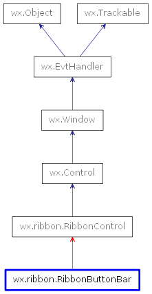
 Inheritance diagram for class RibbonButtonBar: