 wx.ribbon.RibbonBar
Top-level control in a ribbon user interface.
Serves as a tabbed container for wx.ribbon.RibbonPage - a ribbon user interface typically has a ribbon bar, which contains one or more RibbonPages, which in turn each contain one or more RibbonPanels, which in turn contain controls.
While a wx.ribbon.RibbonBar has tabs similar to a wx.Notebook, it does not follow the same API for adding pages. Containers like wx.Notebook can contain any type of window as a page, hence the normal procedure is to create the sub-window and then call wx.BookCtrlBase.AddPage . As wx.ribbon.RibbonBar can only have wx.ribbon.RibbonPage as children (and a wx.ribbon.RibbonPage can only have a wx.ribbon.RibbonBar as parent), when a page is created, it is automatically added to the bar - there is no AddPage equivalent to call.
After all pages have been created, and all controls and panels placed on those pages, Realize must be called.
 Window Styles
This class supports the following styles:
wx.ribbon.RIBBON_BAR_DEFAULT_STYLE: Defined as wx.ribbon.RIBBON_BAR_FLOW_HORIZONTAL | wx.ribbon.RIBBON_BAR_SHOW_PAGE_LABELS | wx.ribbon.RIBBON_BAR_SHOW_PANEL_EXT_BUTTONS | wx.ribbon.RIBBON_BAR_SHOW_TOGGLE_BUTTON | wx.ribbon.RIBBON_BAR_SHOW_HELP_BUTTON.wx.ribbon.RIBBON_BAR_FOLDBAR_STYLE: Defined as wx.ribbon.RIBBON_BAR_FLOW_VERTICAL | wx.ribbon.RIBBON_BAR_SHOW_PAGE_ICONS | wx.ribbon.RIBBON_BAR_SHOW_PANEL_EXT_BUTTONS | wx.ribbon.RIBBON_BAR_SHOW_PANEL_MINIMISE_BUTTONSwx.ribbon.RIBBON_BAR_SHOW_PAGE_LABELS: Causes labels to be shown on the tabs in the ribbon bar.wx.ribbon.RIBBON_BAR_SHOW_PAGE_ICONS: Causes icons to be shown on the tabs in the ribbon bar.wx.ribbon.RIBBON_BAR_FLOW_HORIZONTAL: Causes panels within pages to stack horizontally.wx.ribbon.RIBBON_BAR_FLOW_VERTICAL: Causes panels within pages to stack vertically.wx.ribbon.RIBBON_BAR_SHOW_PANEL_EXT_BUTTONS: Causes extension buttons to be shown on panels (where the panel has such a button).wx.ribbon.RIBBON_BAR_SHOW_PANEL_MINIMISE_BUTTONS: Causes minimise buttons to be shown on panels (where the panel has such a button).wx.ribbon.RIBBON_BAR_SHOW_TOGGLE_BUTTON: Causes a toggle button to appear on the ribbon bar at top-right corner. This style is new since wxWidgets 2.9.5.wx.ribbon.RIBBON_BAR_SHOW_HELP_BUTTON: Causes a help button to appear on the ribbon bar at the top-right corner. This style is new since wxWidgets 2.9.5. Events Emitted by this Class
Handlers bound for the following event types will receive a wx.ribbon.RibbonBarEvent parameter.
See also
See also
 Methods Summary
__init__ |
Default constructor. |
AddPageHighlight |
Highlight the specified tab. |
ArePanelsShown |
Indicates whether the panel area of the ribbon bar is shown. |
ClearPages |
Delete all pages from the ribbon bar. |
Create |
Create a ribbon bar in two-step ribbon bar construction. |
DeletePage |
Delete a single page from this ribbon bar. |
DismissExpandedPanel |
Dismiss the expanded panel of the currently active page. |
GetActivePage |
Get the index of the active page. |
GetPage |
Get a page by index. |
GetPageCount |
Get the number of pages in this bar. |
GetPageNumber |
Returns the number for a given ribbon bar page. |
HidePage |
Hides the tab for a given page. |
HidePanels |
Hides the panel area of the ribbon bar. |
IsPageHighlighted |
Indicates whether a tab is currently highlighted. |
IsPageShown |
Indicates whether the tab for the given page is shown to the user or not. |
Realize |
Perform initial layout and size calculations of the bar and its children. |
RemovePageHighlight |
Changes a tab to not be highlighted. |
SetActivePage |
Set the active page by index, without triggering any events. |
SetArtProvider |
Set the art provider to be used be the ribbon bar. |
SetTabCtrlMargins |
Set the margin widths (in pixels) on the left and right sides of the tab bar region of the ribbon bar. |
ShowPage |
Show or hide the tab for a given page. |
ShowPanels |
Shows or hides the panel area of the ribbon bar. |
 Class API
wx.ribbon.RibbonBar(RibbonControl)¶Possible constructors:
RibbonBar()

RibbonBar(parent, id=ID_ANY, pos=DefaultPosition, size=DefaultSize,
          style=RIBBON_BAR_DEFAULT_STYLE)
Top-level control in a ribbon user interface.
__init__(self, *args, **kw)¶ Overloaded Implementations:
__init__ (self)
Default constructor.
With this constructor, Create should be called in order to create the ribbon bar.
__init__ (self, parent, id=ID_ANY, pos=DefaultPosition, size=DefaultSize, style=RIBBON_BAR_DEFAULT_STYLE)
Construct a ribbon bar with the given parameters.
| Parameters: |
|---|
AddPageHighlight(self, page, highlight=True)¶Highlight the specified tab.
Highlighted tabs have a colour between that of the active tab and a tab over which the mouse is hovering. This can be used to make a tab (usually temporarily) more noticeable to the user.
| Parameters: |
|
|---|
New in version 2.9.5.
ArePanelsShown(self)¶Indicates whether the panel area of the ribbon bar is shown.
| Return type: | bool |
|---|
New in version 2.9.2.
See also
ClearPages(self)¶Delete all pages from the ribbon bar.
New in version 2.9.4.
Create(self, parent, id=ID_ANY, pos=DefaultPosition, size=DefaultSize, style=RIBBON_BAR_DEFAULT_STYLE)¶Create a ribbon bar in two-step ribbon bar construction.
Should only be called when the default constructor is used, and arguments have the same meaning as in the full constructor.
| Parameters: | |
|---|---|
| Return type: | bool |
DeletePage(self, n)¶Delete a single page from this ribbon bar.
The user must call wx.ribbon.RibbonBar.Realize after one (or more) calls to this function.
| Parameters: | n (int) – |
|---|
New in version 2.9.4.
DismissExpandedPanel(self)¶Dismiss the expanded panel of the currently active page.
Calls and returns the value from wx.ribbon.RibbonPage.DismissExpandedPanel for the currently active page, or False if there is no active page.
| Return type: | bool |
|---|
GetActivePage(self)¶Get the index of the active page.
In the rare case of no page being active, -1 is returned.
| Return type: | int |
|---|
GetPage(self, n)¶Get a page by index.
None will be returned if the given index is out of range.
| Parameters: | n (int) – |
|---|---|
| Return type: | wx.ribbon.RibbonPage |
GetPageCount(self)¶Get the number of pages in this bar.
| Return type: | int |
|---|
New in version 2.9.4.
GetPageNumber(self, page)¶Returns the number for a given ribbon bar page.
The number can be used in other ribbon bar calls.
| Parameters: | page (wx.ribbon.RibbonPage) – |
|---|---|
| Return type: | int |
New in version 2.9.5.
HidePage(self, page)¶Hides the tab for a given page.
Equivalent to ShowPage(page, false) .
| Parameters: | page (int) – |
|---|
New in version 2.9.5.
HidePanels(self)¶Hides the panel area of the ribbon bar.
This method simply calls ShowPanels with False argument.
New in version 2.9.2.
IsPageHighlighted(self, page)¶Indicates whether a tab is currently highlighted.
| Parameters: | page (int) – |
|---|---|
| Return type: | bool |
New in version 2.9.5.
See also
IsPageShown(self, page)¶Indicates whether the tab for the given page is shown to the user or not.
By default all page tabs are shown.
| Parameters: | page (int) – |
|---|---|
| Return type: | bool |
New in version 2.9.5.
Realize(self)¶Perform initial layout and size calculations of the bar and its children.
This must be called after all of the bar’s children have been created (and their children created, etc.) - if it is not, then windows may not be laid out or sized correctly.
Also calls wx.ribbon.RibbonPage.Realize on each child page.
| Return type: | bool |
|---|
RemovePageHighlight(self, page)¶Changes a tab to not be highlighted.
| Parameters: | page (int) – |
|---|
New in version 2.9.5.
See also
SetActivePage(self, *args, **kw)¶ Overloaded Implementations:
SetActivePage (self, page)
Set the active page by index, without triggering any events.
| Parameters: | page (int) – The zero-based index of the page to activate. |
|---|---|
| Return type: | bool |
| Returns: | True if the specified page is now active, False if it could not be activated (for example because the page index is invalid). |
SetActivePage (self, page)
Set the active page, without triggering any events.
| Parameters: | page (wx.ribbon.RibbonPage) – The page to activate. |
|---|---|
| Return type: | bool |
| Returns: | True if the specified page is now active, False if it could not be activated (for example because the given page is not a child of the ribbon bar). |
SetArtProvider(self, art)¶Set the art provider to be used be the ribbon bar.
Also sets the art provider on all current wx.ribbon.RibbonPage children, and any wx.ribbon.RibbonPage children added in the future.
Note that unlike most other ribbon controls, the ribbon bar creates a default art provider when initialised, so an explicit call to SetArtProvider is not required if the default art provider is sufficient. Also, unlike other ribbon controls, the ribbon bar takes ownership of the given pointer, and will delete it when the art provider is changed or the bar is destroyed. If this behaviour is not desired, then clone the art provider before setting it.
| Parameters: | art (wx.ribbon.RibbonArtProvider) – |
|---|
SetTabCtrlMargins(self, left, right)¶Set the margin widths (in pixels) on the left and right sides of the tab bar region of the ribbon bar.
These margins will be painted with the tab background, but tabs and scroll buttons will never be painted in the margins.
The left margin could be used for rendering something equivalent to the “Office Button”, though this is not currently implemented. The right margin could be used for rendering a help button, and/or MDI buttons, but again, this is not currently implemented.
| Parameters: |
|
|---|
ShowPage(self, page, show_tab=True)¶Show or hide the tab for a given page.
After showing or hiding a tab, you need to call wx.ribbon.RibbonBar.Realize . If you hide the tab for the currently active page (GetActivePage) then you should call SetActivePage to activate a different page.
| Parameters: |
|
|---|
New in version 2.9.5.
ShowPanels(self, show=True)¶Shows or hides the panel area of the ribbon bar.
If the panel area is hidden, then only the tab of the ribbon bar will be shown. This is useful for giving the user more screen space to work with when he/she doesn’t need to see the ribbon’s options.
| Parameters: | show (bool) – |
|---|
New in version 2.9.2.
ActivePage¶See GetActivePage and SetActivePage
PageCount¶See GetPageCount


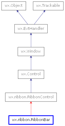
 Inheritance diagram for class RibbonBar: