root2matplot — Beautifying ROOT
—!!!!!!!!!!!!!!!!!!!!!!!!!!!!!!!!!!!!!!!!!!!!!!!
root2matplot is deprecated! The same functionality has been moved to a new package called rootplot:
http://packages.python.org/rootplot/
—!!!!!!!!!!!!!!!!!!!!!!!!!!!!!!!!!!!!!!!!!!!!!!!
ROOT is a powerful data analysis tool within the particle physics community, and the primary lens through which we see our data. The framework includes quite a bit of graphical capabilities, but producing high-quality graphics output was not the first priority in designing its capabilities or its interface.
It becomes useful, then, to consider using an outside library focused on graphics for producing final plots. The pyROOT interface to ROOT makes it easy to have ROOT objects interact with other python modules. The goal of root2matplot is to enable easy plotting of ROOT histograms using the full-featured and mature matplotlib library.
Some possibilities in matplotlib that are unavailable in ROOT include transparent fills and text output using LaTeX.
You may want to use root2matplot to achieve effects or complex diagrams that would be difficult or impossible in ROOT, or you may simply want to recreate a ROOT figure with the higher-quality text available through a LaTeX engine.
For immediate figures with a minimum of effort (with output directly from ROOT or through matplotlib, take a look at the section on the overlayHists command-line tool, which is included in root2matplot
Contact
root2matplot is developed and maintained by Jeff Klukas [(klukas) (at) (wisc) (dot) (edu)]. Feel free to contact the author for help or with suggestions.
Installation
The root2matplot library requires that you have both pyROOT and matplotlib available within a single python installation. This may not be easy (so if you have a CERN lxplus account, check below). You can find some help on the PyROOT site, although specific needs may vary by platform, and you may need to search for additional information (like instructions for a Mac OSX 10.6 installation).
The easiest installation of root2matplot is through pip:
$ pip install root2matplot
If you don’t have pip installed, you can obtain it through easy_install, which is probably already installed on your system if you have python installed:
$ easy_install pip
The pip installer will place the root2matplot library in an appropriate place in your python tree. It will also install the overlayHists script in an appropriate bin directory so that it is available on the command line.
Installing from the Repository
root2matplot is version controlled with Mercurial. To download the latest development version:
$ hg clone http://bitbucket.org/klukas/root2matplot
$ ln -s root2matplot/lib/root2matplot/ /path/to/your/python/lib/area
Easy Access on lxplus
As a temporary solution for lxplus users, you may logon to any of the SLC5 machines (lxplus5) and source the following script:
$ source /afs/cern.ch/user/k/klukas/public/Sharing/root2matplot_setup.sh
This will point to a local installation of root2matplot and should also set up a compatible cocktail of python, matplotlib, and ROOT. After you run the script, you can check that it works by trying out one of the below examples.
Examples
First plot
A first example:
import root2matplot as r2m
import ROOT
from matplotlib import pyplot as plt
from random import gauss

th1f = ROOT.TH1F("hpx", "Distribution of p_{x};p_{x};Events", 40, -4, 4)
for i in range(25000):
    th1f.Fill(gauss(0., 1.))

# Make a figure with width 6 inches and height 4 inches
plt.figure(1, (8, 6))
# Create an axes instance
ax1 = plt.axes()
hist = r2m.Hist(th1f)
# Plot a bar chart in red
hist.bar(color='r')
hist.show_titles()

plt.savefig('first')
plt.show()
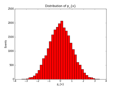
Running this will produce the following as a png file and also display the plot onscreen:

So far, this is probably not the prettiest output you’ve seen, but we’re relying on all of matplotlib‘s defaults. The real power of the solution is the amount of customization that’s possible, and how comparitively easy it is to achieve the results you desire.
Notice that ROOT’s simplified TeX-esque syntax doesn’t isn’t understood by matplotlib. By default, matplotlib uses an internal typesetting engine that allows simple expressions following the official TeX syntax, using $ to denote math mode and \ characters to start commands. To handle conversion from the names you gave the histograms in ROOT to names that are compatible with matplotlib, you can provide a list of ordered pairs in the Hist constructor with the replace keyword:
replacements = [('p_{x}', r'$p_x$'),
                ('#eta', r'$\eta$')]
hist.bar(color='r', replace=replacements)
This will replace all instances of p_{x} with $p_x$, generating the correct LaTeX expressions, and you should give it a try. Notice the r prefix on the second string, which denotes a “raw” string. In this case, it doesn’t matter, but if the LaTeX string were to contain any commands using \, a normal string would interpret these as escaped characters.
Now, let’s add the replacements above and make a more ROOT-style filled histogram with a single line along the top of the bins:
import root2matplot as r2m
import ROOT
import matplotlib
from matplotlib import pyplot as plt
from random import gauss

th1f = ROOT.TH1F("hpx", "Distribution of p_{x};p_{x};Events", 40, -4, 4)
for i in range(25000):
    th1f.Fill(gauss(0., 1.))

plt.figure()
replace = [('p_{x}', r'$p_x$'),
           ('#eta', r'$\eta$')]
hist = r2m.Hist(th1f, replace=replace)
hist.hist(color='r', histtype='stepfilled')
hist.show_titles()
plt.savefig('firstrep', dpi=50)
plt.show()

A more complicated example
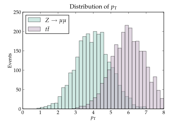
Imagine that you are preparing a LaTeX document using the mathpazo package, which sets up Palatino as the default font. With matplotlib, you can generate an output PS or PDF that has all its text rendered with the full-blown LaTeX distribution on your system, so that your plots match exactly with the rest of your document. The following example loads the PDF backend, and enables the text.usetex option to tell matplotlib to use your real LaTeX engine. It also highlights some extra matplotlib functions, like transparent fills, legends, and colormaps.:
import matplotlib
matplotlib.use("PDF")
matplotlib.rc('text', usetex=True)
matplotlib.rc('font', family="serif", serif="palatino")
from matplotlib import pyplot as plt
import ROOT
import root2matplot as r2m
from random import gauss

th1f_1 = ROOT.TH1F("hpt1", "Distribution of pT;pT;Events", 40, 0, 8)
th1f_2 = ROOT.TH1F("hpt2", "Distribution of pT;pT;Events", 40, 0, 8)
for i in range(2500):
    th1f_1.Fill(gauss(4, 1.))
    th1f_2.Fill(gauss(6, 1.))

cmap = plt.get_cmap('Set3')
colors = [cmap(i/5.) for i in range(5)]

plt.figure(1, (6, 4))
ax1 = plt.axes()
replace = [('pT', r'$p_\mathrm{T}$'),
           ('ZMM', r'$Z\rightarrow \mu\mu$'),
           ('ttbar', r'$t\bar{t}$')]
hist1 = r2m.Hist(th1f_1, replace)
hist2 = r2m.Hist(th1f_2, replace)
stack = r2m.HistStack()
stack.add(hist1, color=colors[0], label="ZMM", replace=replace)
stack.add(hist2, color=colors[1], label="ttbar", replace=replace)
stack.bar(alpha=0.5)
stack.show_titles()
plt.legend(loc='upper left')
plt.xlim(0,8)

plt.savefig('second')
The result should look like this:

A Two-Dimensional Histogram
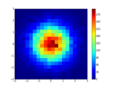
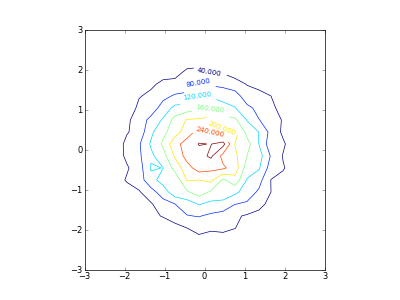
root2matplot also supports 2D histograms. A Hist2D object has functions such as box, col, or colz to replicate ROOT drawing options, but also the ability to make contour plots:
import root2matplot as r2m
import ROOT
from matplotlib import pyplot as plt
from random import gauss

th2f = ROOT.TH2F("data", "", 20, -3, 3, 20, -3, 3)
for i in range(20000):
    th2f.Fill(gauss(0., 1.), gauss(0., 1.))

ax = plt.axes()
hist = r2m.Hist2D(th2f)
hist.colz()
plt.savefig('colz')
plt.clf() # clear figure
ax = plt.axes(aspect='equal')
hist.contour()
plt.savefig('contour')
The results should look like:


The root2matplot Library
Core implementation of the module
- class root2matplot.core.Hist(hist, replace=None, label='__nolabel__', title=None, xlabel=None, ylabel=None)
A container to hold the parameters from a ROOT histogram.
- TH1F(name='')
- Return a ROOT.TH1F object with the contents of this Hist
- bar(xerr=False, yerr=False, **kwargs)
Generate a matplotlib bar figure.
All additional keyword arguments will be passed to pyplot.bar.
- barh(xerr=False, yerr=False, yoffset=0.0, width=0.80000000000000004, **kwargs)
Generate a horizontal matplotlib bar figure.
All additional keyword arguments will be passed to pyplot.barh.
- delete_bin(index)
- Delete a the contents of a bin, sliding all the other data one bin to the left. This can be useful for histograms with labeled bins.
- divide(denominator)
Return the simple quotient with errors added in quadrature.
- This function is called by the division operator:
- hist3 = hist1.divide_wilson(hist2) <–> hist3 = hist1 / hist2
- divide_wilson(denominator)
- Return an efficiency plot with Wilson score interval errors.
- errorbar(xerr=False, yerr=False, **kwargs)
Generate a matplotlib errorbar figure.
All additional keyword arguments will be passed to pyplot.errorbar.
- errorbarh(xerr=False, yerr=False, **kwargs)
Generate a horizontal matplotlib errorbar figure.
All additional keyword arguments will be passed to pyplot.errorbar.
- hist(**kwargs)
Generate a matplotlib hist figure.
All additional keyword arguments will be passed to pyplot.hist.
- min(threshold=None)
- Return the y-value of the bottom tip of the lowest errorbar.
- scale(factor)
- Scale contents, errors, and over/underflow by the given scale factor.
- show_titles()
- Add the titles defined in the ROOT histogram to the figure.
- class root2matplot.core.Hist2D(hist, replace=None, label='__nolabel__', title=None, xlabel=None, ylabel=None)
A container to hold the paramters from a 2D ROOT histogram.
- box(maxsize=40, **kwargs)
Draw a box plot with size indicating content using pyplot.scatter.
The data will be normalized, with the largest box using a marker of size maxsize (in points).
- col(**kwargs)
- Draw a colored box plot using pyploy.imshow.
- colz(**kwargs)
- Draw a colored box plot with a colorbar using pyplot.imshow.
- contour(**kwargs)
- Draw a contour plot.
- class root2matplot.core.HistStack(hists=None, title=None, xlabel=None, ylabel=None, replace=None)
A container to hold Hist objects for plotting together.
When plotting, the title and the x and y labels of the last Hist added will be used unless specified otherwise in the constructor.
- add(hist, replace=None, **kwargs)
Add a Hist object to this stack.
Any additional keyword arguments will be added to just this Hist when the stack is plotted.
- bar(**kwargs)
Make a matplotlib bar plot, with all Hists in the stack overlaid.
Any additional keyword arguments will be passed to pyplot.bar. You will probably want to include a transparency value (i.e. alpha=0.5).
- bar3d(**kwargs)
- Info
- barh(**kwargs)
Make a horizontal clustered matplotlib bar plot.
Any additional keyword arguments will be passed to pyplot.barh.
- barstack(**kwargs)
Make a matplotlib bar plot, with each Hist stacked upon the last.
Any additional keyword arguments will be passed to pyplot.bar.
- errorbar(offset=False, **kwargs)
Make a matplotlib errorbar plot, with all Hists in the stack overlaid.
Passing ‘offset=True’ will slightly offset each dataset so overlapping errorbars are still visible. Any additional keyword arguments will be passed to pyplot.errorbar.
- errorbarh(**kwargs)
Make a horizontal matplotlib errorbar plot, with all Hists in the stack overlaid.
Any additional keyword arguments will be passed to pyplot.errorbar.
- hist(**kwargs)
Make a matplotlib hist plot.
Any additional keyword arguments will be passed to pyplot.hist, which allows a vast array of possibilities. Particlularly, the histtype values such as ‘barstacked’ and ‘stepfilled’ give completely different results. You will probably want to include a transparency value (i.e. alpha=0.5).
- max()
- Return the value of the highest bin of all hists in the stack.
- min(threshold=None)
Return the value of the lowest bin of all hists in the stack.
If threshold is specified, only values above the threshold will be considered.
- class root2matplot.core.RootFile(file_name, name=None)
A wrapper for TFiles, allowing easier access to methods.
- cd(directory='')
- Make directory the current directory.
- get(object_name)
- Return a Hist object from the given path within this file.
- root2matplot.core.axes_broken_y(axes, upper_frac=0.5, break_frac=0.02, ybounds=None, xlabel=None, ylabel=None)
Replace the current axes with a set of upper and lower axes.
The new axes will be transparent, with a breakmark drawn between them. They share the x-axis. Returns (upper_axes, lower_axes).
If ybounds=[ymin_lower, ymax_lower, ymin_upper, ymax_upper] is defined, upper_frac will be ignored, and the y-axis bounds will be fixed with the specified values.
- root2matplot.core.get(object_name)
- Return a Hist object with the given name.
- root2matplot.core.ls(directory=None)
- Return a python list of ROOT object names from the given directory.
- root2matplot.core.pwd()
- Return ROOT’s present working directory.
The overlayHists Command-Line App
Draw histograms to image files, specifying options on the command line.
You can overlay plots from multiple ROOT files with identical structure.
Customization of overlayHists
Most of the style options for your output can be specified in a rootlogon.C or matplotlibrc depending on which kind of output you’d like. Documentation on this kind of configuration can be found on the websites of ROOT and matplotlib respectively.
There are, however, several style options which are specific to overlayHists. These include the line colors and markers used, as well as the dictionary used for text replacement with matplotlib. If you’d like to customize these for your own use, simply make a configuration file with a .py extension and add the file to your list of arguments to overlayHists. You can get a nice default with all the configurable parameters by calling:
$ overlayHists --config
The command-line options available are described in the help message output:
$ overlayHists -h

Usage: overlayHists [options] [style_config.py] [file1.root ...]

Documentation: http://packages.python.org/root2matplot/

Function: overlays corresponding histograms from several files, dumping the
  images into a directory structure that mirrors that of the ROOT file and,
  if output format is pdf, also merging all images into a single file.
  Most style options can be controlled from your rootlogon.C macro.

Power users: advanced operation using configuration files is described in the
  full online documentation.  This allows you control over colors, styles,
  names for the legends, and more.  Get the default config with --config.

Matplotlib: if you have the matplotlib python plotting library installed on your
  system, you can produce output in matplotlib.  This will be activated by
  enabling any of the options 'mpl', 'bar', 'errorbar', 'hist', or 'stack'.

Options:
  --version             show program's version number and exit
  -h, --help            show this help message and exit
  --config              do nothing but write a template configuration file
                        called overlayHists_config.py
  -e EXT, --ext=EXT     choose an output extension; default is png
  -m, --markers         add markers to histograms
  -s, --sticky          enable name-based special plotting options (see below)
  --merge               creates a single pdf file containing all plots
  --noclean             skips destroying the output directory before drawing
  --data=FILENUM        the histogram from the FILENUMth (starting from 1)
                        file will be drawn as black datapoints, while all
                        others will be filled, as is the custom for showing
                        data vs. Monte Carlo.
  --output=NAME         name of output directory; default is 'overlaidHists'
  --numbering           add a page number in the upper right of each plot
  --path=PATH           only process plot(s) in the given location or its
                        subdirectories; PATH may be a regular expression (use
                        .* for wildcard)
  --normalize=VALUE     if integer, normalize to the VALUEth file (starting
                        with 1); if float, scale by VALUE
  --range=LOWxHIGH      only use the specified data range in determining the
                        normalization
  --colormap=COLORMAP   Select colors from the given matplotlib colormap
                        rather than the defaults
  --ncolors=NCOLORS     The number of colors with which to divide the colormap
  --legend=LOC          Place legend in LOC, according to matplotlib location
                        codes; examples include 'upper right', 'center', or
                        'center left'
  --title=TITLE         Replace the plot titles, or add to them by preceeding
                        with a '+'
  --xlabel=XLABEL       Replace the x-axis labels, or add to them by
                        preceeding with a '+'
  --ylabel=YLABEL       Replace the y-axis labels, or add to them by
                        preceeding with a '+'
  --grid                Toggle the grid on or off for both axes
  --gridx               Toggle the grid on or off for the x axis
  --gridy               Toggle the grid on or off for the y axis
  --efficiency-from=DENOM
                        Divide all plots by the histogram in path DENOM
  --processors=NUM      Divide plot making up into NUM different processes

  Options specific to ROOT (default) output:
    --draw="p H"        argument to pass to ROOT's Draw command; try 'e' for
                        error bars
    --draw2D="box"      argument to pass to ROOT's Draw command for 2D hists
                        (only drawn when a single file is present); set to ""
                        to turn off 2D drawing
    -f, --fill          Histograms will have a color fill

  Producing output with matplotlib:
    --mpl               produce output in matplotlib; automatically turned on
                        by --stack, --errorbar, --bar, or --hist
    --mpl2D="box"       Type of plot to produce for 2D histograms in
                        matplotlib.  Choose from 'contour', 'col', 'colz', or
                        'box'
    --stack             output a matplotlib stacked bar graph
    --errorbar          output a matplotlib errorbar graph
    --bar               output a matplotlib bar graph
    --hist              output a matplotlib hist graph (with solid fill)
    --alpha=ALPHA       set the transparency factor used for matplotlib bar
                        and hist graphs (default is 0.5; 1.0 is fully opaque)
    --transparent       use a transparent background
    --size=SIZE         Define the plot size as 'width x height' in inches;
                        default is '6x4.5'
    --dpi=DPI           Set the resolution of matplotlib output (default is
                        100)

  Special plotting options:
    Use the command line options given below to apply changes to all
    plots.  If you only wish to apply an option to a specific plot, you
    can use '-s' to turn on sticky keywords (such as 'Norm').  Any plot
    that includes the given keyword in its ROOT name will have the option
    applied regardless of its presence or absence on the command line.

    -n, --area-normalize
                        'Norm': area normalize the histograms
    --efficiency        'Eff' : force y axis scale to run from 0 to 1
    --logx              'Logx': force log scale for x axis
    --logy              'Logy': force log scale for y axis
    --zero              'Zero': force zero for the y-axis minimum
    --overflow          'Overflow' : display overflow content in highest bin
    --underflow         'Underflow': display underflow content in lowest bin
    --ratio=FILENUM     'Ratio': cut the canvas in two, displaying on the
                        bottom the ratio of each histogram to the histogram in
                        the FILENUMth (starting from 1) file.