pyCMBS provides a flexible tool to compare output from models with other models as well as with observational data.
The main input for model benchmarking is model data and observational datasets as well as a user specified configuration. After running the benchmarking, you get a report (PDF format) as well as a lot of figures and statistics which contain usefull information. The benchmarking is based ona modular approach and allows the user to customize the results by activating and deactivating specific components.
The next steps will guide you through a benchmarking session to get you started.
set up a working directory and change to it:
# set up a working directory somewhere on your machine
mkdir -p ~/temp/my_first_benchmarking
cd ~/temp/my_first_benchmarking
set up an initial configuration:
# simply run the pycmbs-benchmarking.py script
# if properly installed, you should be able to just run it from the console
pycmbs-benchmarking.py init
This gives you:
$ ls
configuration  template.cfg
If you do this for the first time, then it is recommended that you make yourself familiar with the content of the configuration directory. This contains
adapt the configuration file (xxx.cfg) to your needs. The configuration file is the center part where you specify
Details about the configuration file are specified below.
Do it! Run the benchmarking now by executing:
pycmbs.py your_config_script.cfg
The benchmarking part of pyCMBS is based on a modular system of diagnostics. Currently the focus is on the comparison of climate mean states between observations and models. Below are examples of the currently implemented components which the user can combine to generate a specific report for a certain variable.
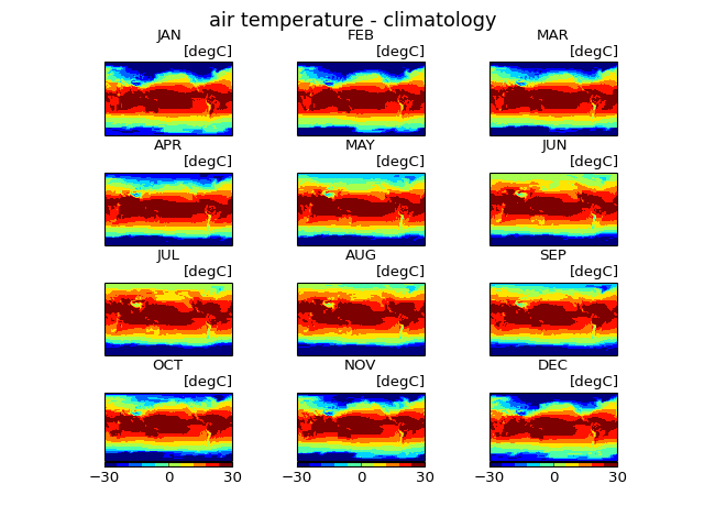
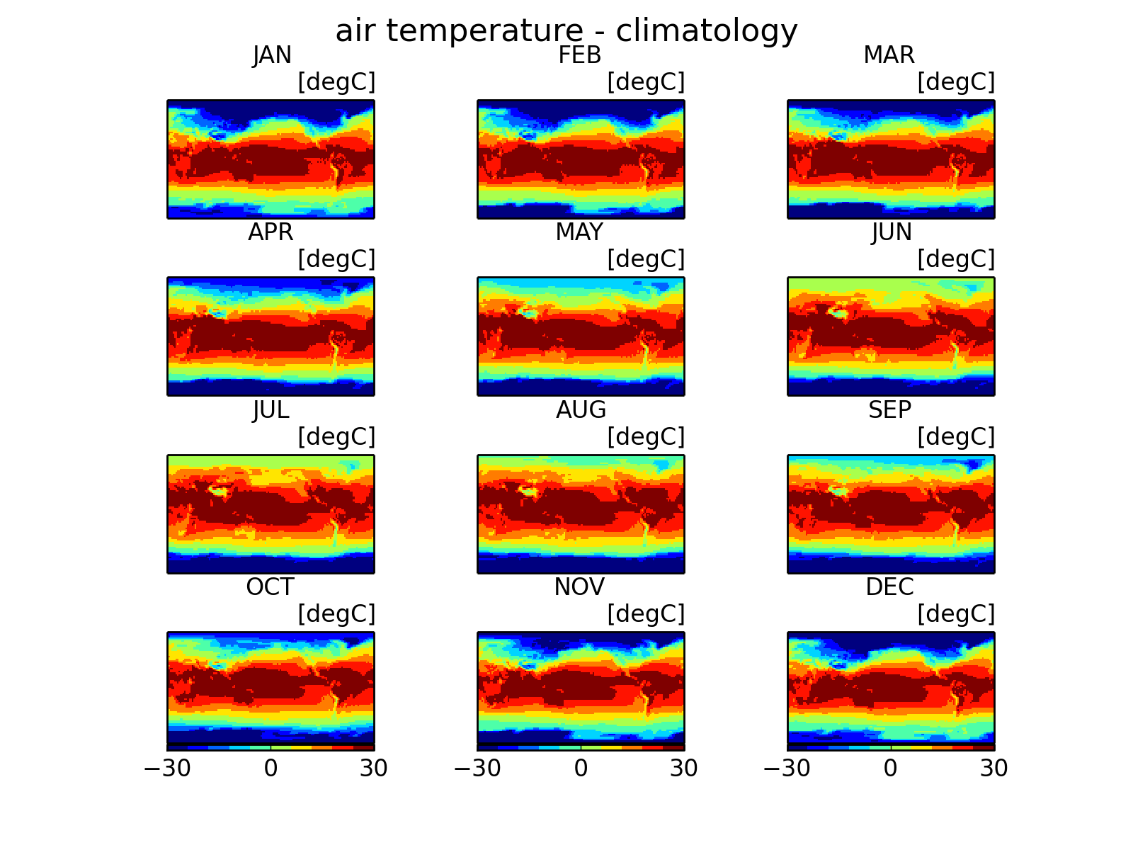
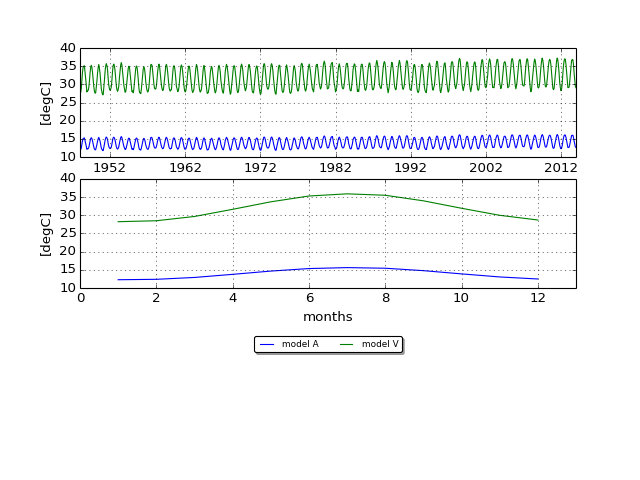
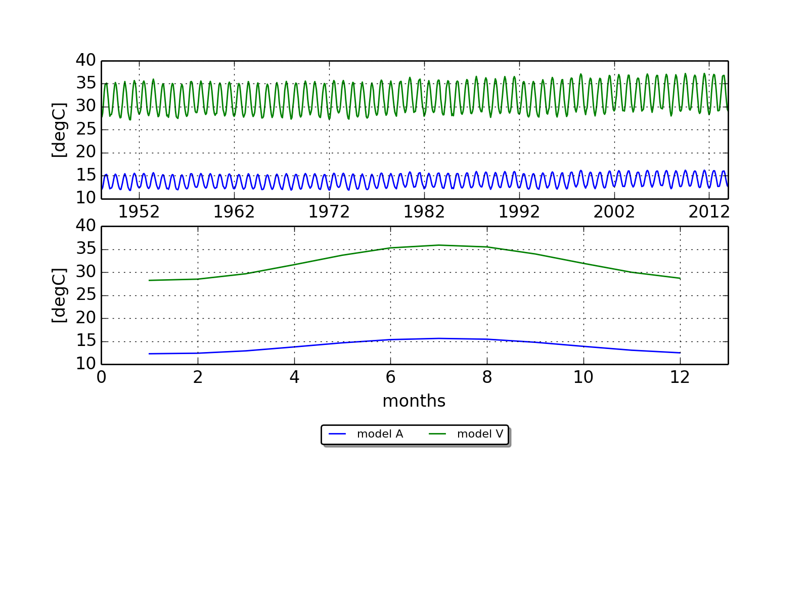
Creates a figure with seasonal or monthly climatological means of the investigated variables.
(Source code, png, hires.png, pdf)

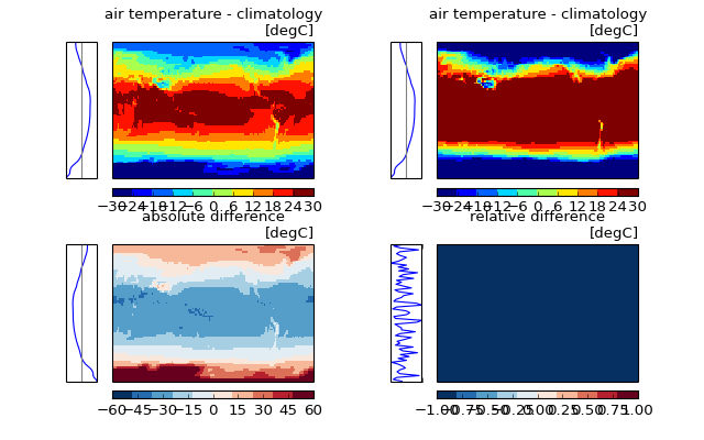
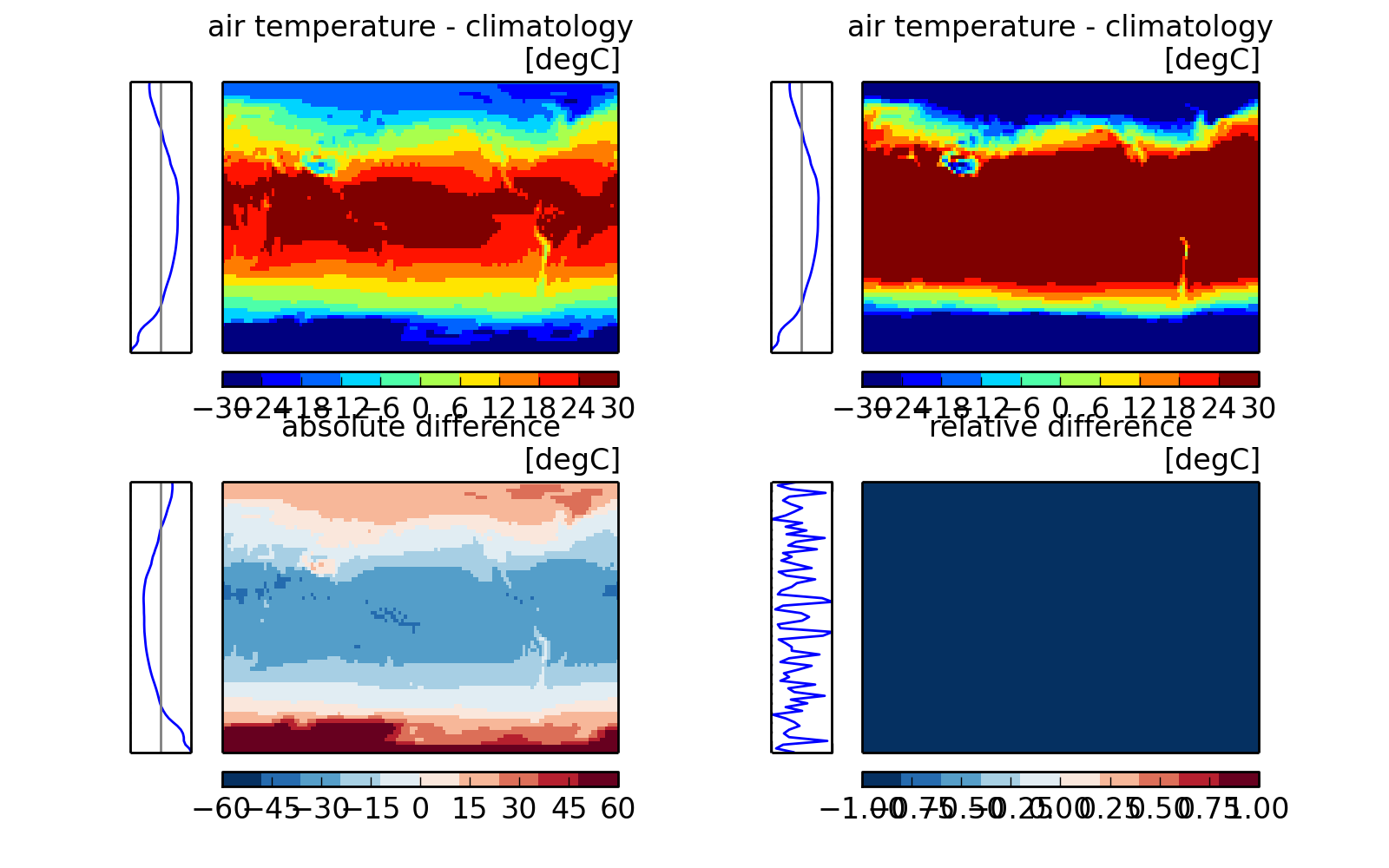
Create a plot of temporal mean fields of observations and models and their absolute and relative differences.
(Source code, png, hires.png, pdf)
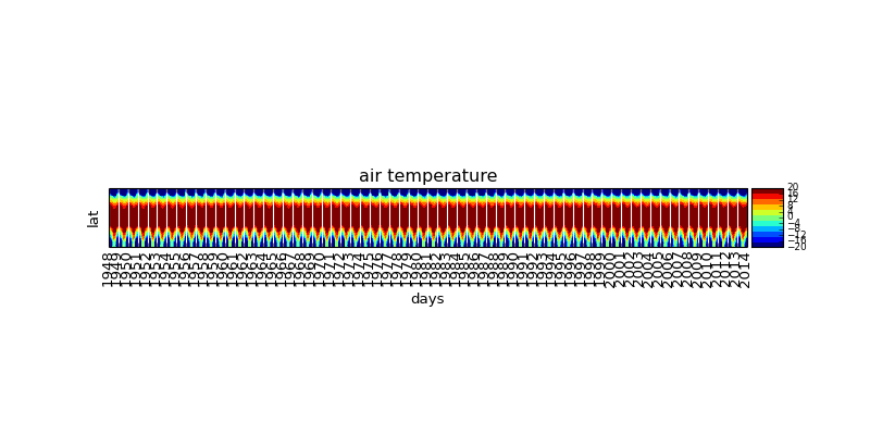
Generates a standard Hovmoeller plot (= time-latitude plot) of the variable.
(Source code, png, hires.png, pdf)

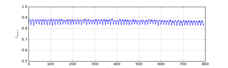
The correlation between the spatial patterns of investigated variables between models and observations can be vizualized in differnt ways. For each month or season the spatial correlation coefficient is estimated and vizualized as a timeline.
(Source code, png, hires.png, pdf)
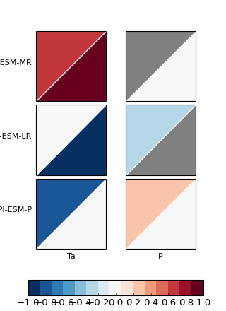
The Portraet diagram was proposed by Gleckler et al. (2008). It is an efficient way to vizualize the relative rank of different models for comparisons against different observations. While the original Portraet diagram supports only two different observations, pyCMBS supports up to four different datasets for each variable.
(Source code, png, hires.png, pdf)

Global mean timeseries of a specific variable. The global mean values are estimated using proper area weighting. The plot object also allows to automatically plot climatology mean values.
(Source code, png, hires.png, pdf)
