Examples
There are several examples distributed with Pycha. You can find them in the examples directory. Let’s analyze some of them.
Bar charts
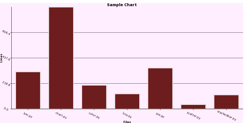
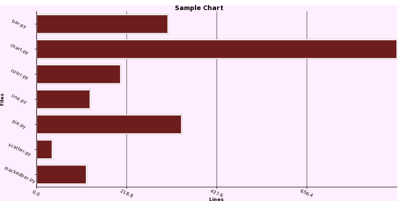
One of the most common used charts are bar charts. In the examples/barchart.py programm there are examples of vertical and horizontal bar charts:
import sys

import cairo

import pycha.bar

from lines import lines


def barChart(output, chartFactory):
    surface = cairo.ImageSurface(cairo.FORMAT_ARGB32, 800, 400)

    dataSet = (
        ('lines', [(i, l[1]) for i, l in enumerate(lines)]),
        )

    options = {
        'axis': {
            'x': {
                'ticks': [dict(v=i, label=l[0]) for i, l in enumerate(lines)],
                'label': 'Files',
                'rotate': 25,
            },
            'y': {
                'tickCount': 4,
                'rotate': 25,
                'label': 'Lines'
            }
        },
        'background': {
            'chartColor': '#ffeeff',
            'baseColor': '#ffffff',
            'lineColor': '#444444'
        },
        'colorScheme': {
            'name': 'gradient',
            'args': {
                'initialColor': 'red',
            },
        },
        'legend': {
            'hide': True,
        },
        'padding': {
            'left': 0,
            'bottom': 0,
        },
        'title': 'Sample Chart'
    }
    chart = chartFactory(surface, options)

    chart.addDataset(dataSet)
    chart.render()

    surface.write_to_png(output)

if __name__ == '__main__':
    if len(sys.argv) > 1:
        output = sys.argv[1]
    else:
        output = 'barchart.png'
    barChart('v' + output, pycha.bar.VerticalBarChart)
    barChart('h' + output, pycha.bar.HorizontalBarChart)
There are several things we can note in this source code listing:
- The barChart function will create a bar chart and save it to a png file
- The information shown in the chart is takes from the lines.py module, which, basically is a python module with a dataset composed of the number of lines that some Pycha modules have.
- Most of the code is about setting the options dictionary. We will see more about these options in the reference chapter but they should be pretty intuitive.
Let’s see the output of running this programm.

Vertical Bar Chart

Horizontal Bar Chart
Pie charts
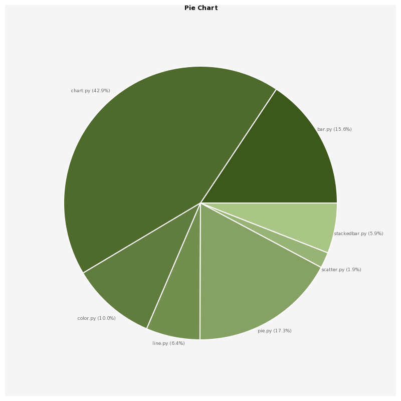
Pie charts are another very common type of charts. They are useful when you only have one dataset and you want to compare each piece of information with the rest.
Let’s see the pie example in the examples/piechart.py file:
import sys

import cairo

import pycha.pie

from lines import lines

def pieChart(output):
    surface = cairo.ImageSurface(cairo.FORMAT_ARGB32, 800, 800)

    dataSet = [(line[0], [[0, line[1]]]) for line in lines]

    options = {
        'axis': {
            'x': {
                'ticks': [dict(v=i, label=d[0]) for i, d in enumerate(lines)],
            }
        },
        'legend': {
            'hide': True,
        },
        'title': 'Pie Chart',
    }
    chart = pycha.pie.PieChart(surface, options)

    chart.addDataset(dataSet)
    chart.render()

    surface.write_to_png(output)

if __name__ == '__main__':
    if len(sys.argv) > 1:
        output = sys.argv[1]
    else:
        output = 'piechart.png'
    pieChart(output
As you can see, this programm is very similar to the barchart.py one. The only remarkable difference is that we are using the pycha.pie.PieChart class instead of the bar alternatives.
Let’s see the output.

Pie Chart
Line charts
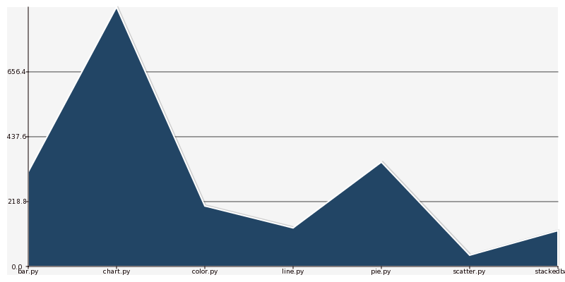
The other big type of chart is line charts. As you may guest, in the examples directory there is a programm that generates a lines chart, it is called examples/linechart.py:
import sys

import cairo

import pycha.line

from lines import lines

def lineChart(output):
    surface = cairo.ImageSurface(cairo.FORMAT_ARGB32, 800, 400)

    dataSet = (
        ('lines', [(i, l[1]) for i, l in enumerate(lines)]),
        )

    options = {
        'axis': {
            'x': {
                'ticks': [dict(v=i, label=l[0]) for i, l in enumerate(lines)],
            },
            'y': {
                'tickCount': 4,
            }
        },
        'background': {
            'color': '#eeeeff',
            'lineColor': '#444444'
        },
        'colorScheme': {
            'name': 'gradient',
            'args': {
                'initialColor': 'blue',
            },
        },
        'legend': {
            'hide': True,
        },
    }
    chart = pycha.line.LineChart(surface, options)

    chart.addDataset(dataSet)
    chart.render()

    surface.write_to_png(output)

if __name__ == '__main__':
    if len(sys.argv) > 1:
        output = sys.argv[1]
    else:
        output = 'linechart.png'
    lineChart(output)
No big surprises in this one neither since the structure is exactly the same as in the other examples. Just the chart factory is different.

Line Chart
As you can see, by default the area between the line and the x axis is filled. You can change this option if you just want to render the line.
Other examples
There are other chart examples in the examples directory of the pycha source code. I suggest you to check them out to discover other types of charts like:
- Error bar charts
- Scatter charts
- Stacked bar charts
There are also other examples where you can see special features and options:
- svg.py will output a SVG vectorial file instead of a PNG one.
- interval.py will use the interval option to setup the x axis
- color/colorschemes.py will try different color schemes.